Chapter 4: Medium Design
- Tour page beginning CodePen
- Tour page ending CodePen
- Home page beginning CodePen
- Home page ending CodePen
- All assets and content for the medium designs
NOTE: Gradient is missing in these screenshots.
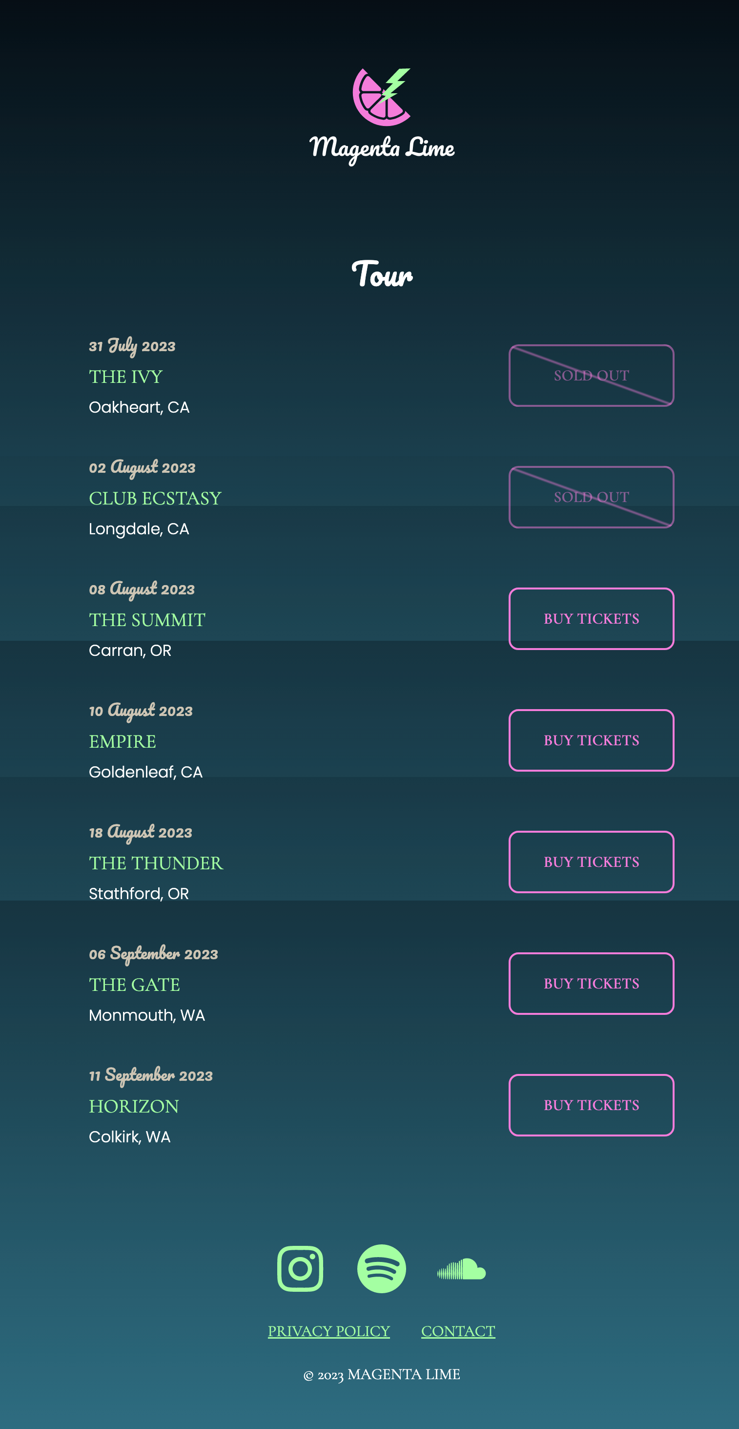
4a: Tour Page
4A part 1: HTML Structure
Edit the HTML and CSS on the existing easy site and remove the extra materials. We only need the tour information, not the photos and reviews. Remove the CSS for reviews and photos and the media queries EXCEPT the wrapper styles.
When you are done, you should have the Magenta Lime logo, the tour dates, and the footer.
4A part 2: Add Buttons
Add links for "Buy Tickets" (class of button-primary) or
"Sold Out" (classes of button-primary button-soldout).
          <p><a class="button-primary button-soldout">Sold Out</a></p>
          <p><a href="#" class="button-primary">Buy Tickets</a></p>
Note that "sold out" has no href attribute. This means the link is not clickable. However, it still has a hover state!
With our basic HTML in place, we'll style a bunch of things.
- Make changes to the
bodybase styling. - Set up the tour dates and (future) buttons into a grid.
- Investigate how to make a diagonal line for our button. Style the buttons with and without the diagonal line.
- Revisit button styling within the grid and adjust the layout.
-
Add fonts to the page. You will need Google Fonts, Cormorant
Garamond 400 and 600, Pacifico 400, and Poppins 300 and 600. The URL
will look like
https://fonts.googleapis.com/css2?family=Cormorant+Garamond:wght@400;600&family=Pacifico&family=Poppins:wght@300;600&display=swapAdd this to your CodePen under Settings - CSS - External Links. - Create variables for these font families and apply the new font families to the page.
4A part 3: Footer challenge
Create a footer for the page that looks like this. On hover, the icons should change color from lime to cyan (like the Spotify icon).
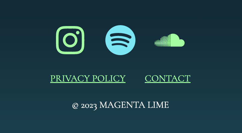
Useful links include the following icons for Instagram, Spotify, and
Soundcloud. Remember that you may view this link directly in your
browser and then view source to get the SVG code, or you may use these
in an img element. Link each icon to the home page for
each social media page.
https://assets.codepen.io/296057/fem-instagram.svg

https://assets.codepen.io/296057/fem-spotify.svg

https://assets.codepen.io/296057/fem-soundcloud.svg
Be sure to consider the correct markup for the footer, then style accordingly. This CSS Tricks article may be useful for you.
When done, integrate the footer into your Tour page. Your page should look something like this (click for larger format):
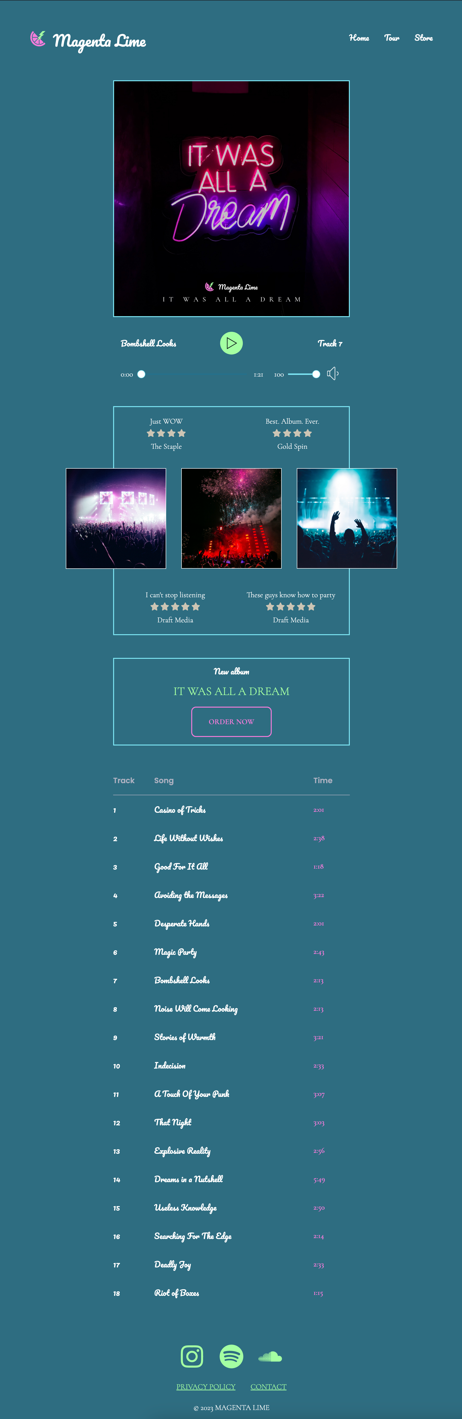
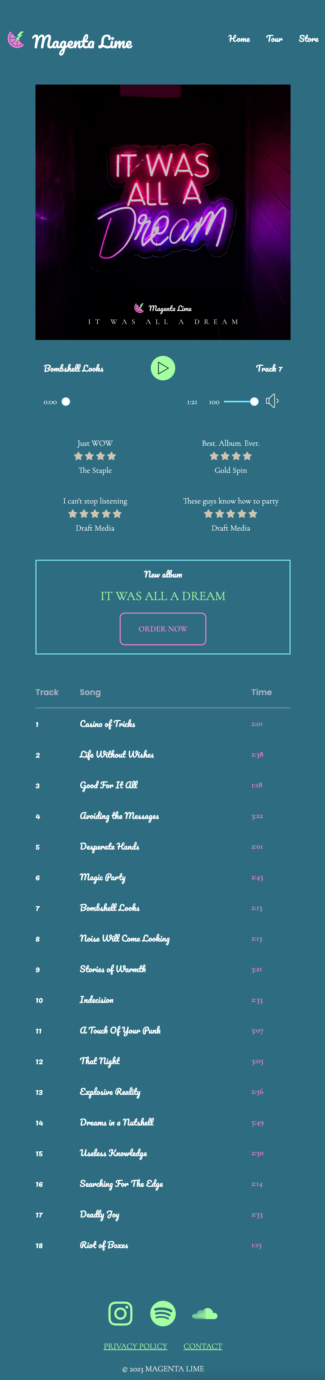
4B: Album and Tracklist
We reuse our button and some font styles to make our album box and playlist.
4B part 1: Markup the HTML
Discuss what the right markup might be, then mark up the text.
4B Part 2: Styling
Style the album box and the track list to match the mobile view screenshot. Remember that the gradient background is smooth -- the choppy background is an artifact of the screenshot technology.
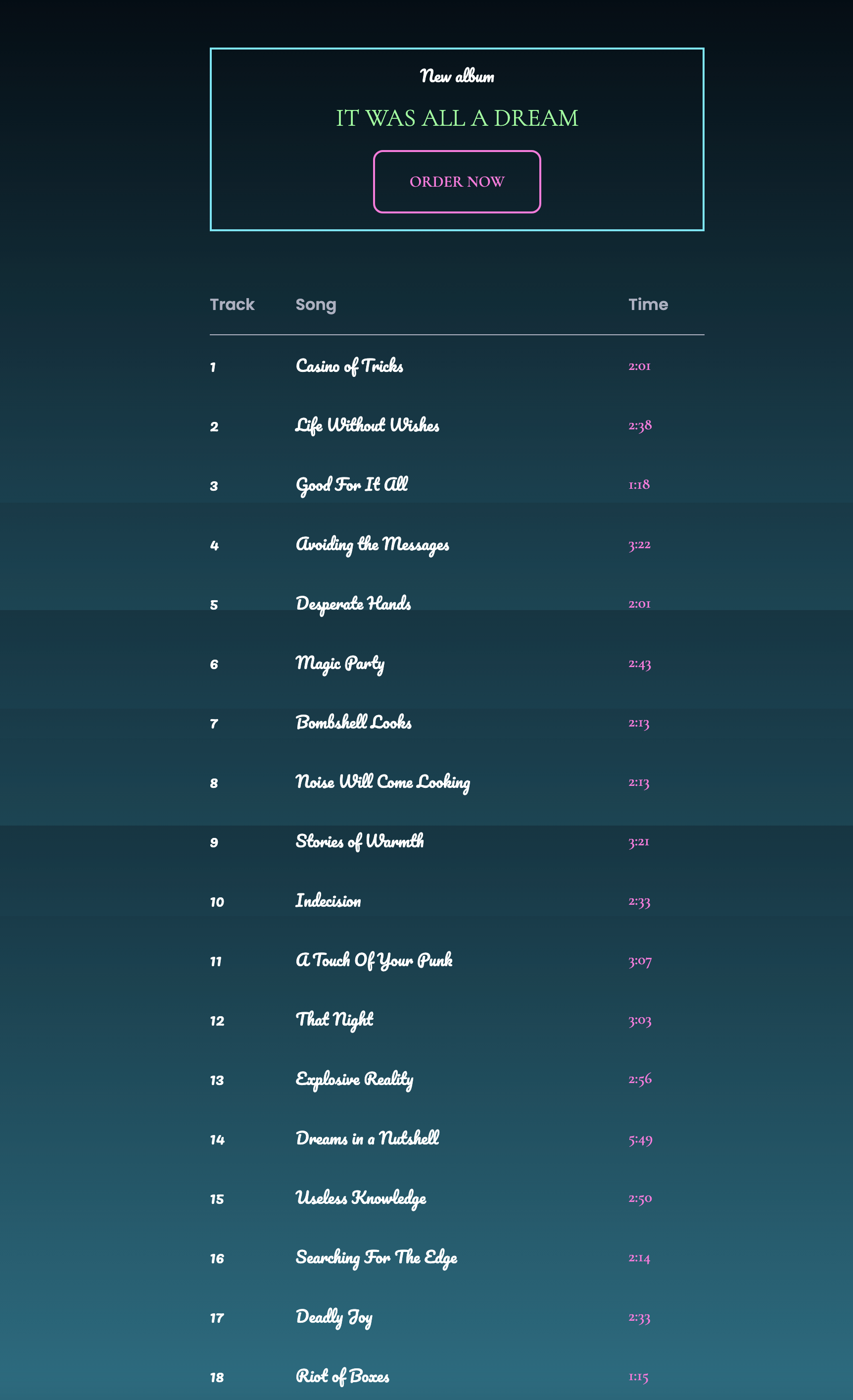
Tips:
- Max width for album box and table: 500px, centered on the page
- Make separate layers for the album and the playlist
- Focus on getting the right colors, fonts, and general layout
- Don't worry so much about the exact spacing, unless you have extra time to figure this out.
- New color for the column labels -- #ADB0C0
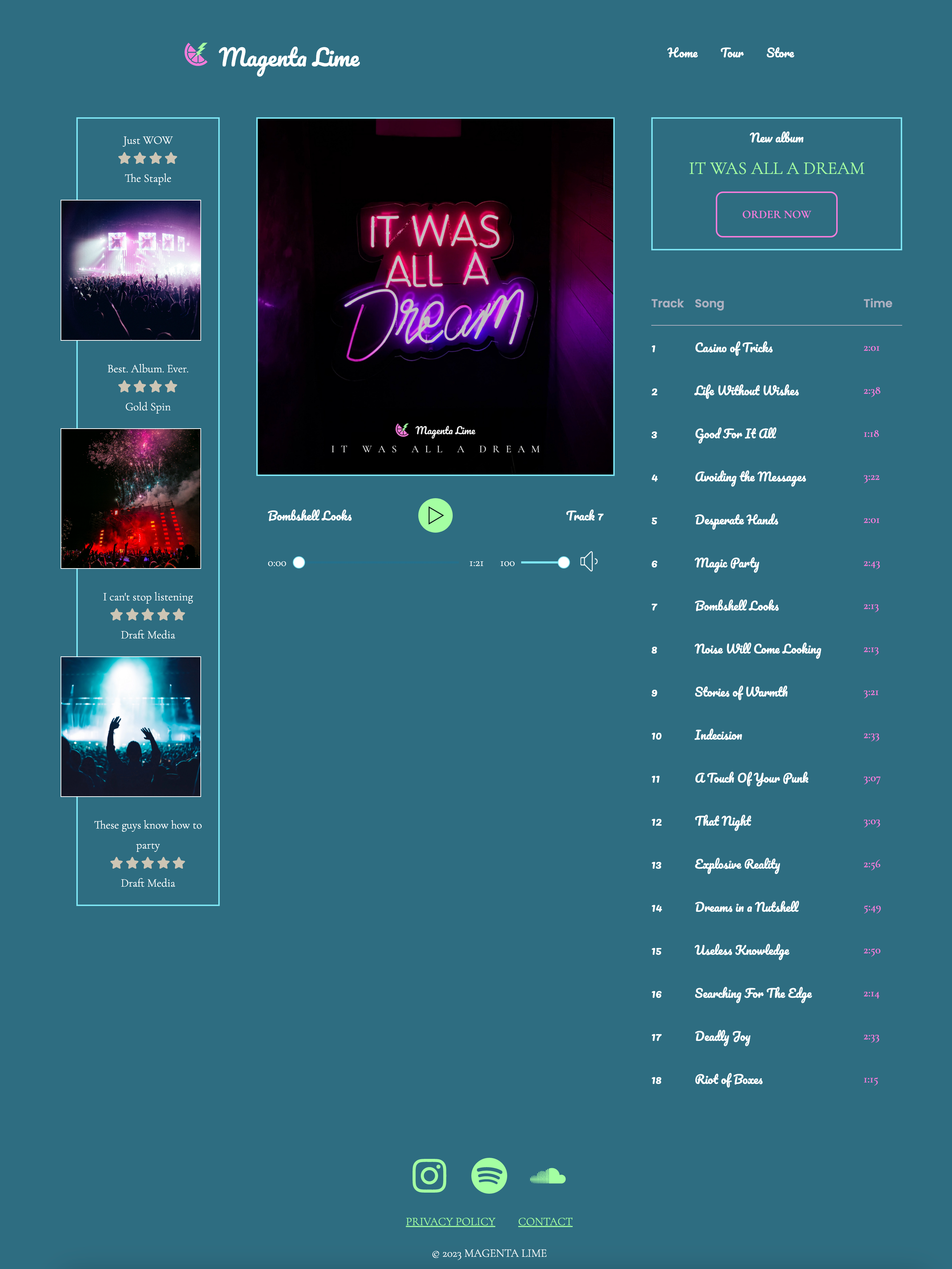
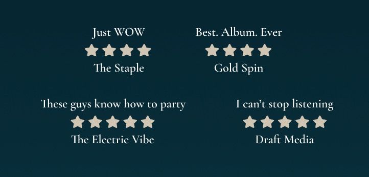
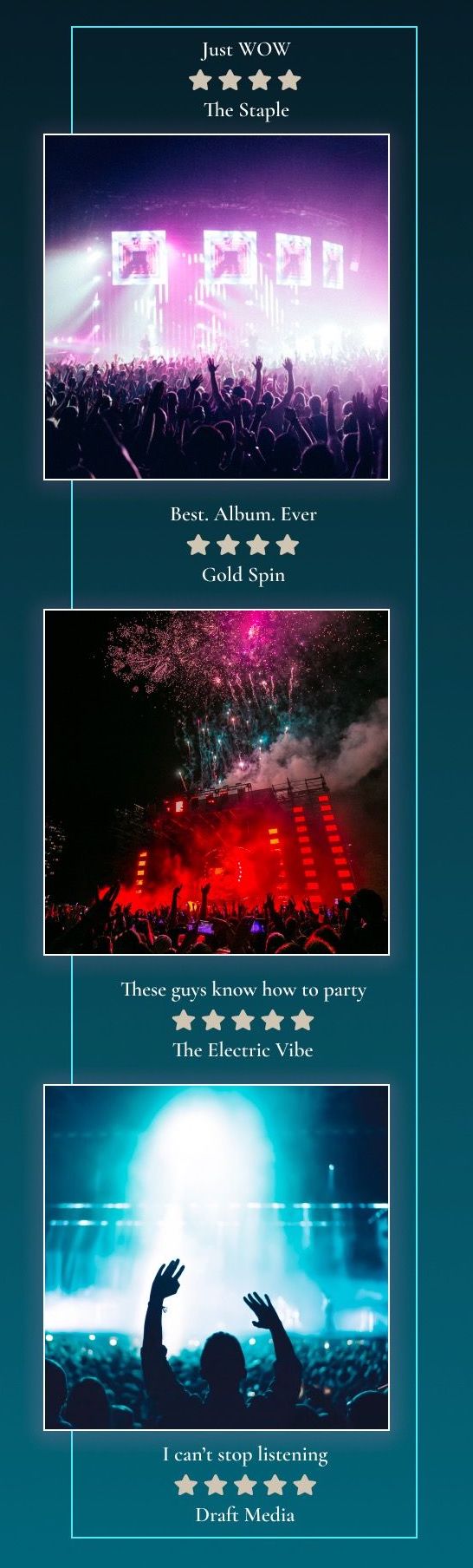
4C: Reviews and Images
The first thing we must do is discuss our approach. We start with HTML from our easy design for the 3 images and 4 quotes that make up this section of the page. I've also included all CSS we've generated for the medium design to this point, along with the style from the easy design for this section.
On mobile, we show only the reviews.
On tablet, the images appear in between the reviews, and a border appears (but the images hang outside of it). You may find hints in this article helpful. (Remember: sometimes you don't want a grid blowout... but sometimes you do!)
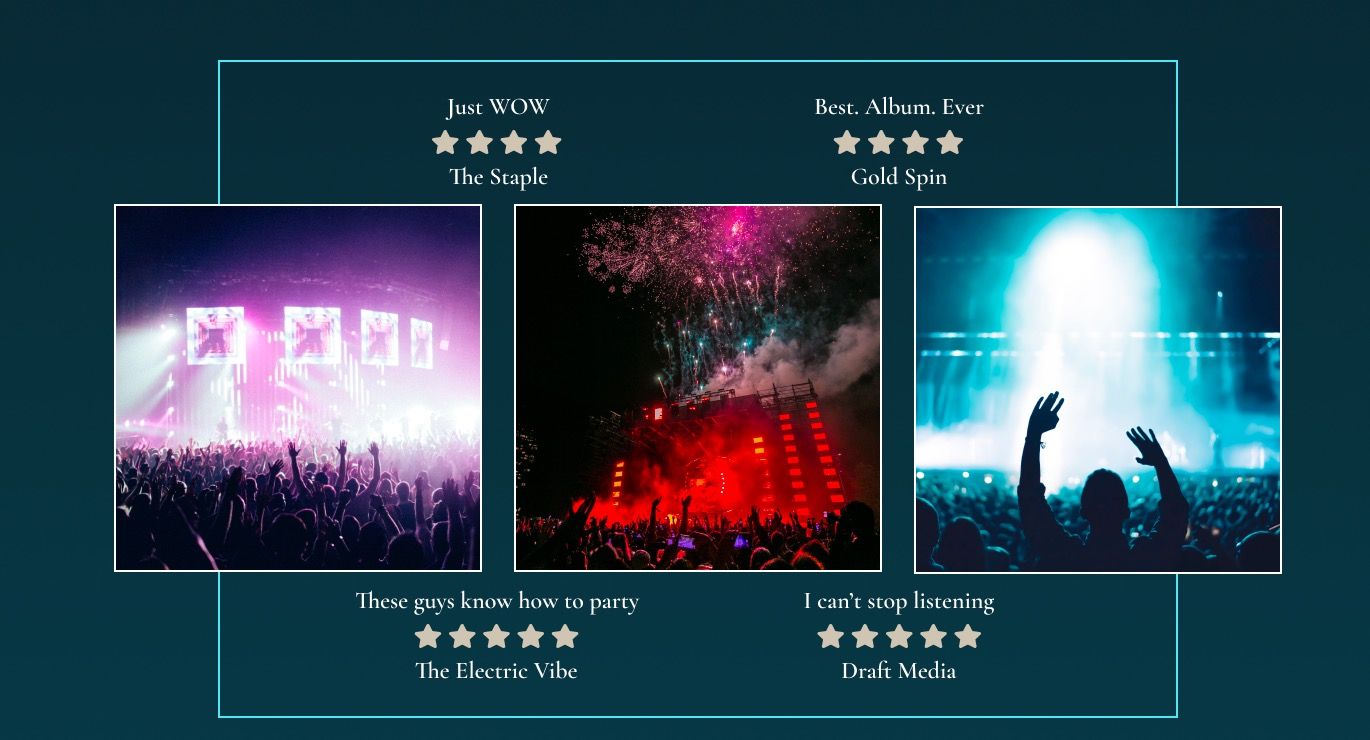
On desktop, we stack the images and reviews on top of each other.
What should be our default source order? How will we handle the appearing/disappearing images? What technology will we use to lay this out?
4C part 1: HTML markup
Let's plan our markup order for the layout on desktop, where quotes and images are stacked on top of each other in a column.
Modify the HTML such that each image and each figure is a child of a
container (currently aside). Add the additional quote:
These guys know how to party
(5 stars)
The Electric Vibe
The result should be alternating figures and images. Each image should
be surrounded by a div with a class of
.featured-img for image flexibility.
4C part 2: Styling
We will style the mobile, tablet, and desktop versions of the layout.
4D: Audio Player
We'll reskin an existing audio player.
- Audio player forked from CSS Tricks - fork to start this work
- Article describing how the audio player was created
- Beginning CodePen
4D part 1: Evaluation
We found an audio player we want to use on our site, as it has most of the elements we want. Audio seek slider, volume slider, play button, mute button are all included. The current track name is not included, but we can add this.
The styling is not what we want, but as long as most of the elements are there, we are in great shape for re-skinning.
(Note: our design is static, playing only one track. Making this dynamic and loading a track from a list/database is beyond the scope of this course.)
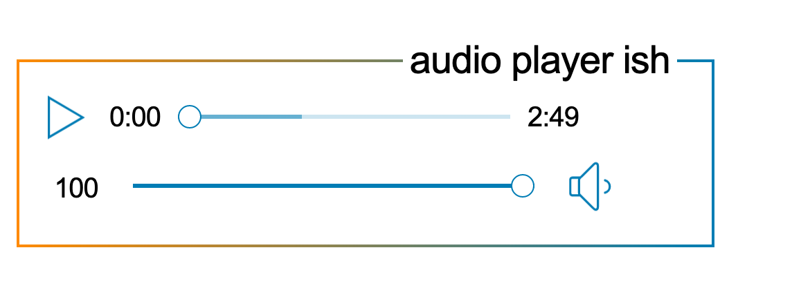
Things we need to change:
- Substitute placeholder audio with our own
- Seek slider and volume should be next to each other
- Play button should be above the sliders and restyled
- Track name and number should appear (this is an addition)
- Colors, fonts, size, spacing of course
- In general, the JavaScript author relies on IDs for selection. Therefore, to keep the JS working, we should not eliminate or change the ID names or separate them from their elements.
- Note the Lottie Web dependency. This library provides animated icons.
4B part 2: MODIFY HTML
Always start with the HTML!
Consider the layout - what elements need to be added to achieve this layout? Should we use Flexbox or Grid?
4D part 3: SIMPLIFY CSS AND ADD STANDARD STYLES
Read the CSS that's present and delete what doesn't make sense.
- In general, standard HTML element styles will be replaced by our own. Let's delete styles for body, p. For button, delete width, height, and float.
- Look at #audio-player-container and #audio-player-container::before. These include a linear gradient and a white background color. Indeed, this is how we achieve the rainbow border and white background. There are some variables inside of #audio-player-container, so keep those. Otherwise, delete these styles.
- Create a layer for the audio styles, and copy in @layer base for base styling.
-
Note that our fonts don't "work" -- be sure the CodePen has a link
to the appropriate Google fonts.
https://fonts.googleapis.com/css2?family=Cormorant+Garamond:wght@300;400;600&family=Pacifico&family=Poppins:wght@300;600&display=swap - Ending CodePen
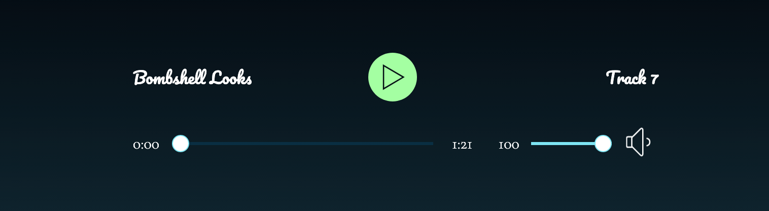
4D part 4: Controls layout
Now let's lay out the grid for our name/play button and the track/volume controls.
4D part 5: FINAL STYLING OF ELEMENTS
Once everything is in the general position, now we can style more carefully with CSS to get the look we want.
4D part 6: Add album image
Let's add the album image above the audio player and wrap the whole thing in a section.
4E: Hamburger menu
Now that you've seen how to repurpose code from elsewhere, you try it. We'll work through each step.
4E part 1: Evaluation
Let's discuss the code we have, including:
- Is this mobile-first or desktop-first code?
- Is this worth re-writing to a format we prefer?
- What about the HTML structure - semantic? Are changes needed?
- What must we keep for the JavaScript to work?
- Where are the icons coming from? Should we keep them or change them?
4E part 2: Modify HTML
We identified the following issues:
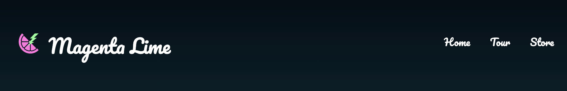
- Need to include our logo (which changes across breakpoints)
- We have three nav options: Home, Tour, Store (all can link to a placeholder)
- Note we don't need the "action" class/nav option when editing CSS.
4E part 3: ADD STANDARD STYLES AND SIMPLIFY CSS
Copy/paste our "base" styling from another pen.
Set up a new layer called "header" for these styles.
Remove styles pertaining to "action".
4E part 4: Style mobile dropdown menu
4F: FINAL SITE ASSEMBLY FOR MOBILE AND TABLET
We have everything coded for this page, at least in mobile format. Let's assemble this into a single document.
Fork the starting head of the document we already created.
Now add elements:
- Album cover and track
- Reviews and images
- New album and track list
- Footer
-
We're missing the button styles from the tour page!
Grab those and add to
album. -
We're missing the wrapper - add the HTML from
tourplus the two media queries. Test in full view - not centered. -
Go to
base, add.wrapper { margin: 0 auto; }to center it on the page. -
Go to
audio, addpadding-bottom: 2rem;to.coverto give space between player and next section. -
Note that the album cover has a blue border on it for tablet and
desktop. Let's add that as well. In the
audiolayer:@media (min-width: 700px) { .cover img { border: 1px solid var(--cyan); } } - Ending CodePen
4G: FINAL SITE WITH DESKTOP LAYOUT
We have everything coded for this page, except we have not finished the desktop layout.