Chapter 5: Difficult Design
5A: Small Elements
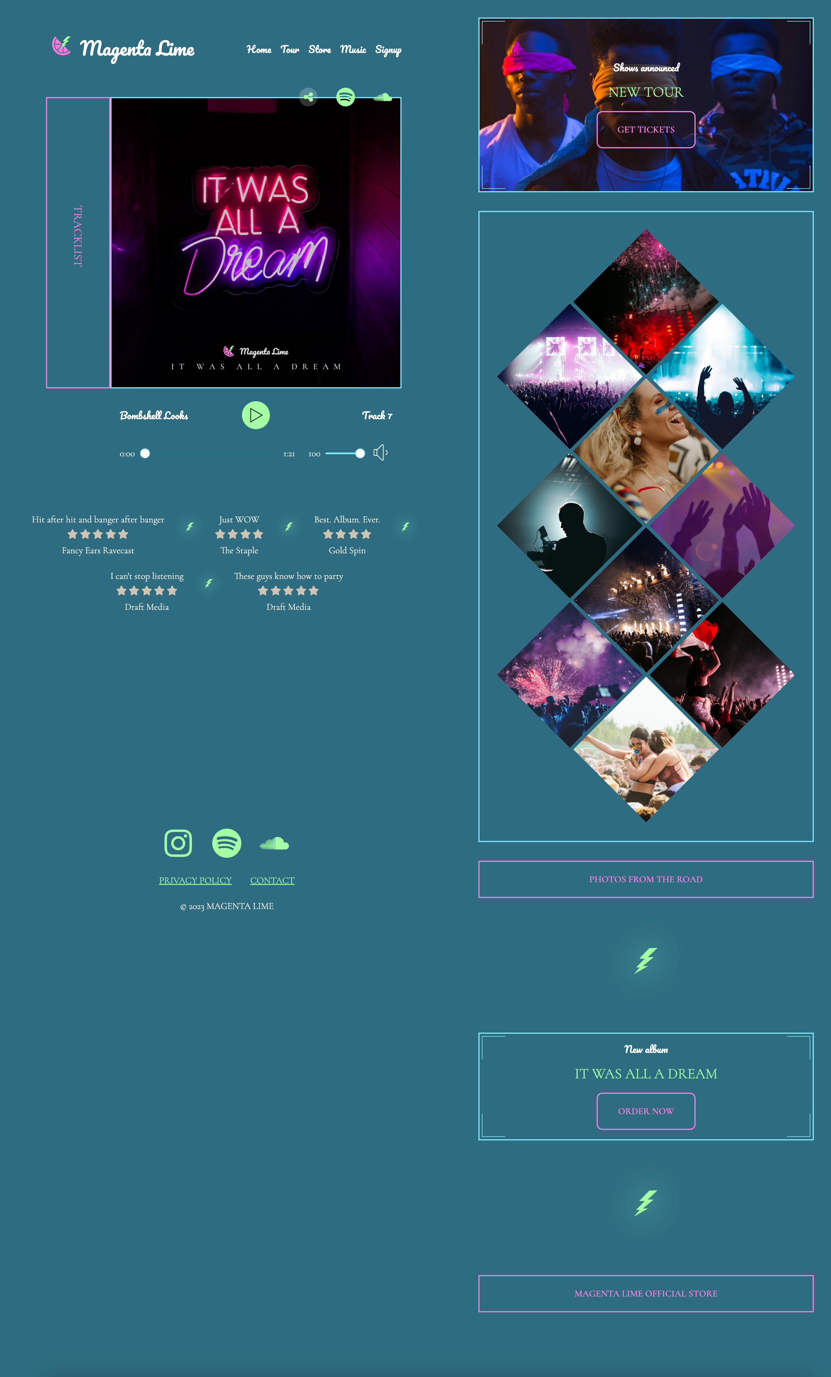
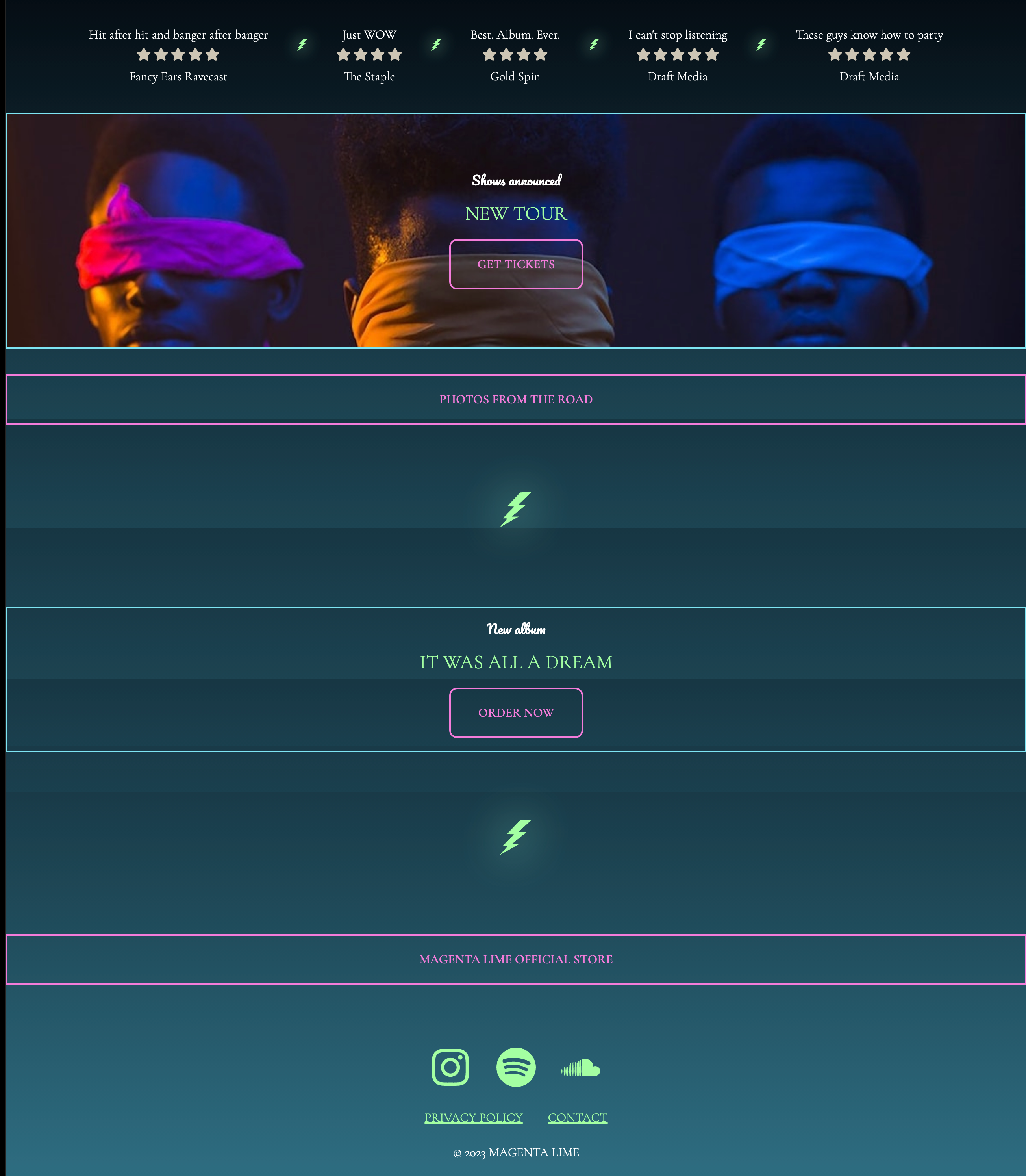
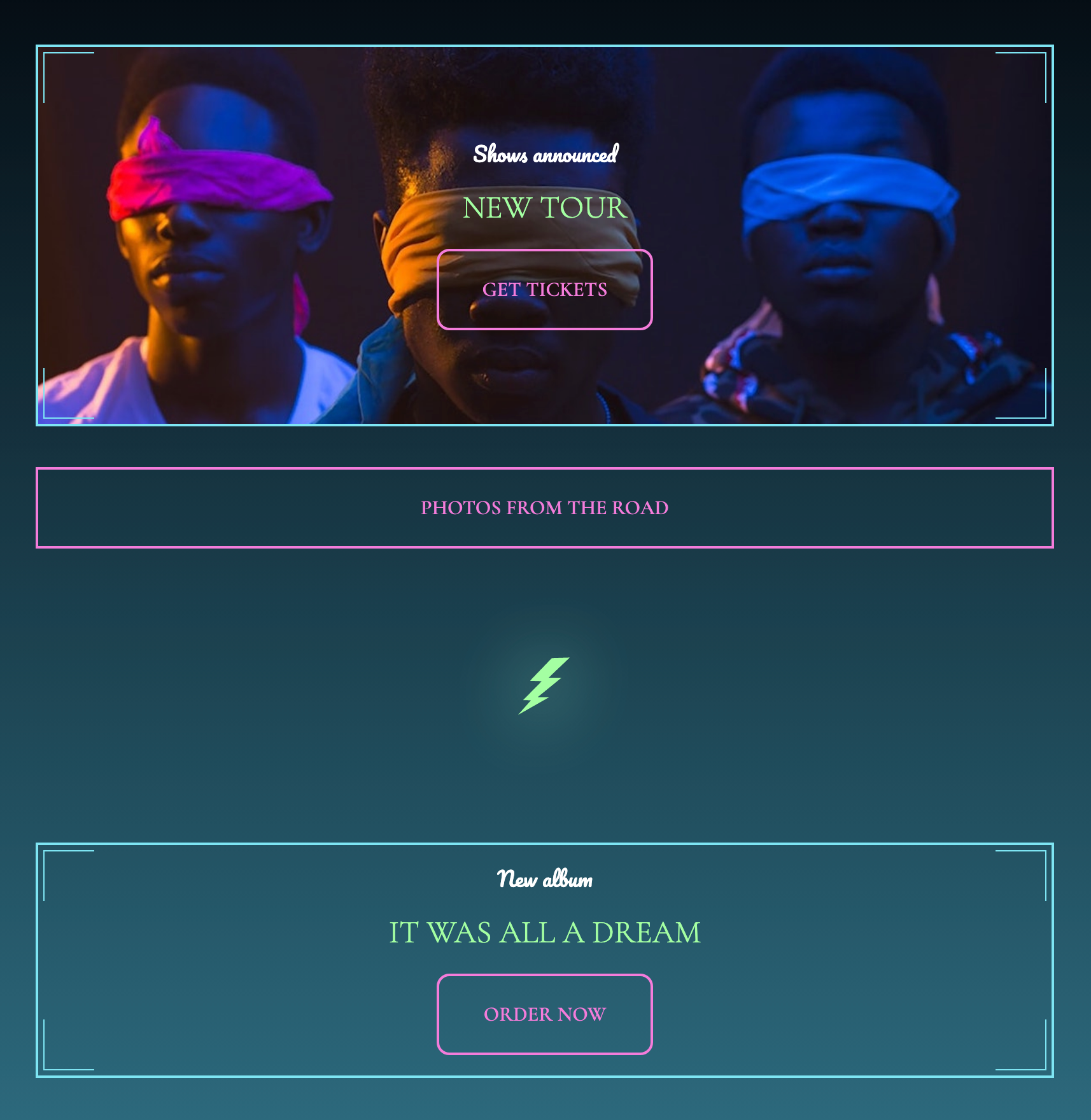
The difficult design has two major areas of focus: the album cover/tracklist, and the diamond images. The rest of the design is fairly straightforward. Therefore, we'll leave it to you to work on this and design a solution for other elements on the page in this starting exercise.
The final design includes some double lines on the corners of some boxes. For now, ignore these. We will create these in the next exercise.
The HTML is in the correct order, but you may need to add some elements (like lightning bolts and maybe some additional styling markup).
The CSS includes the medium solution layers that correspond with this HTML. Reuse code where possible.
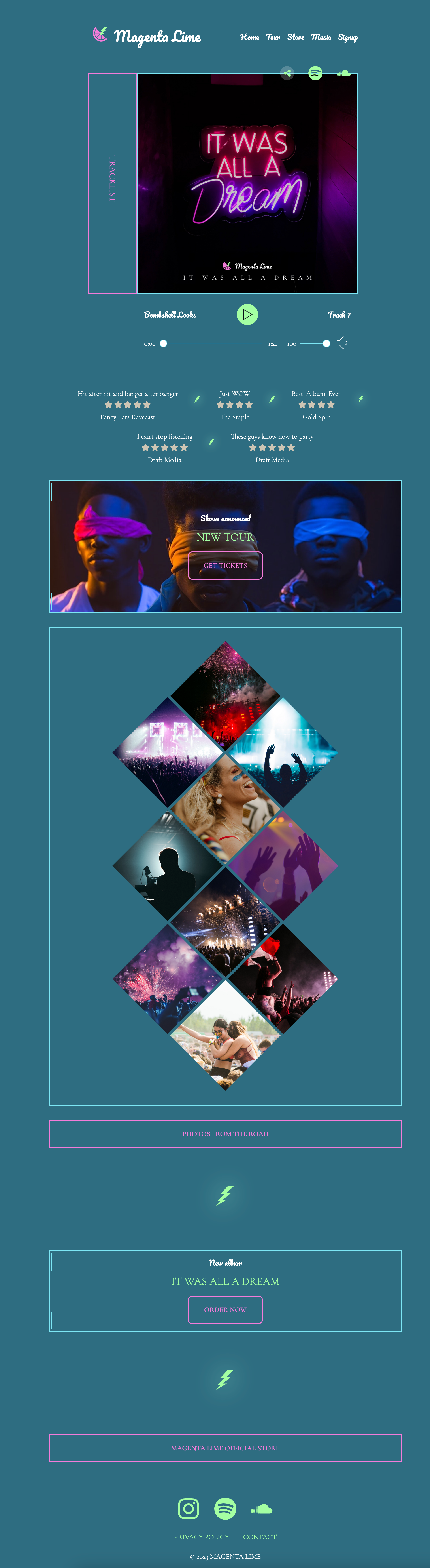
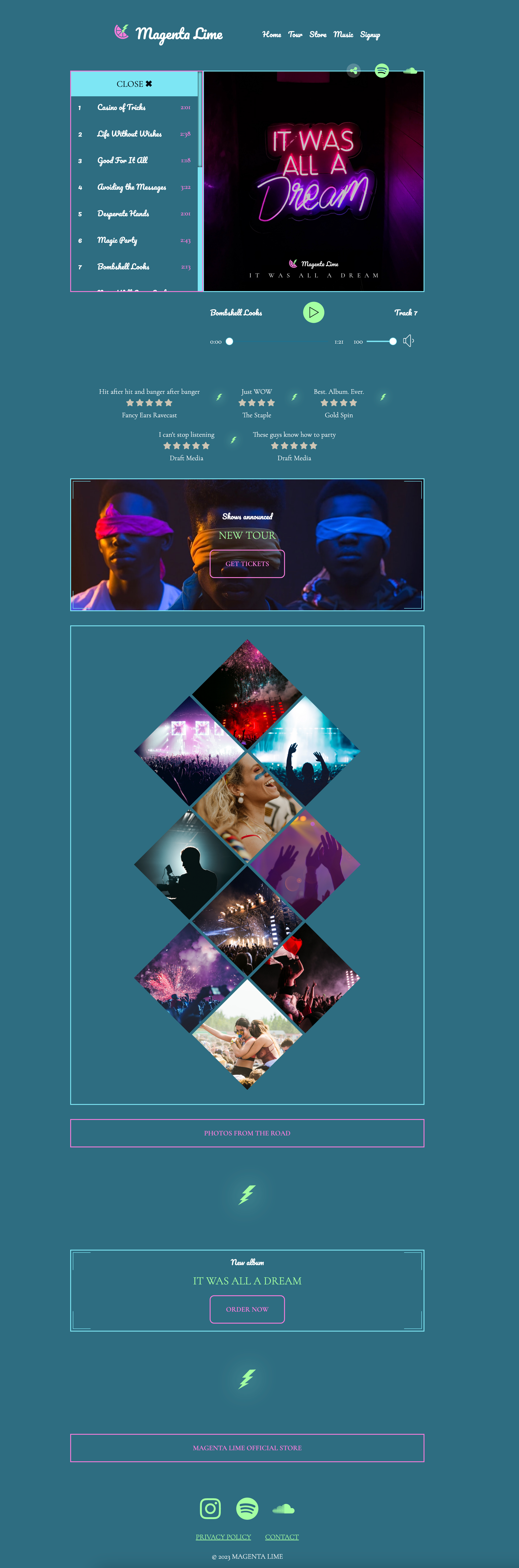
Refer to screenshots for styling each part of the page. Media queries will occur at 800px and 1400px.
- Image for "New Tour" box
- Lightning bolt - or view source for SVG code
- Beginning CodePen
- Ending CodePen
When working through the small elements, remember to iterate over the following steps:
- Consider the HTML markup. What is semantic? What is needed to make the CSS work?
- Style from the outside in. Start with the breakpoints on the wrapper. Then worry about individual elements.
5B: Double border corners
Double borders on just the corner of some boxes may seem impossible to start with. However, there are several possible solutions to this issue.
We will use an approach that requires no extra markup. Instead, if the container contains at least one child, we can hijack the before and after nodes of the container and the first child to create boxes. Show the border only on two sides and position these extra boxes at the edges of the container.
5C: Navigation
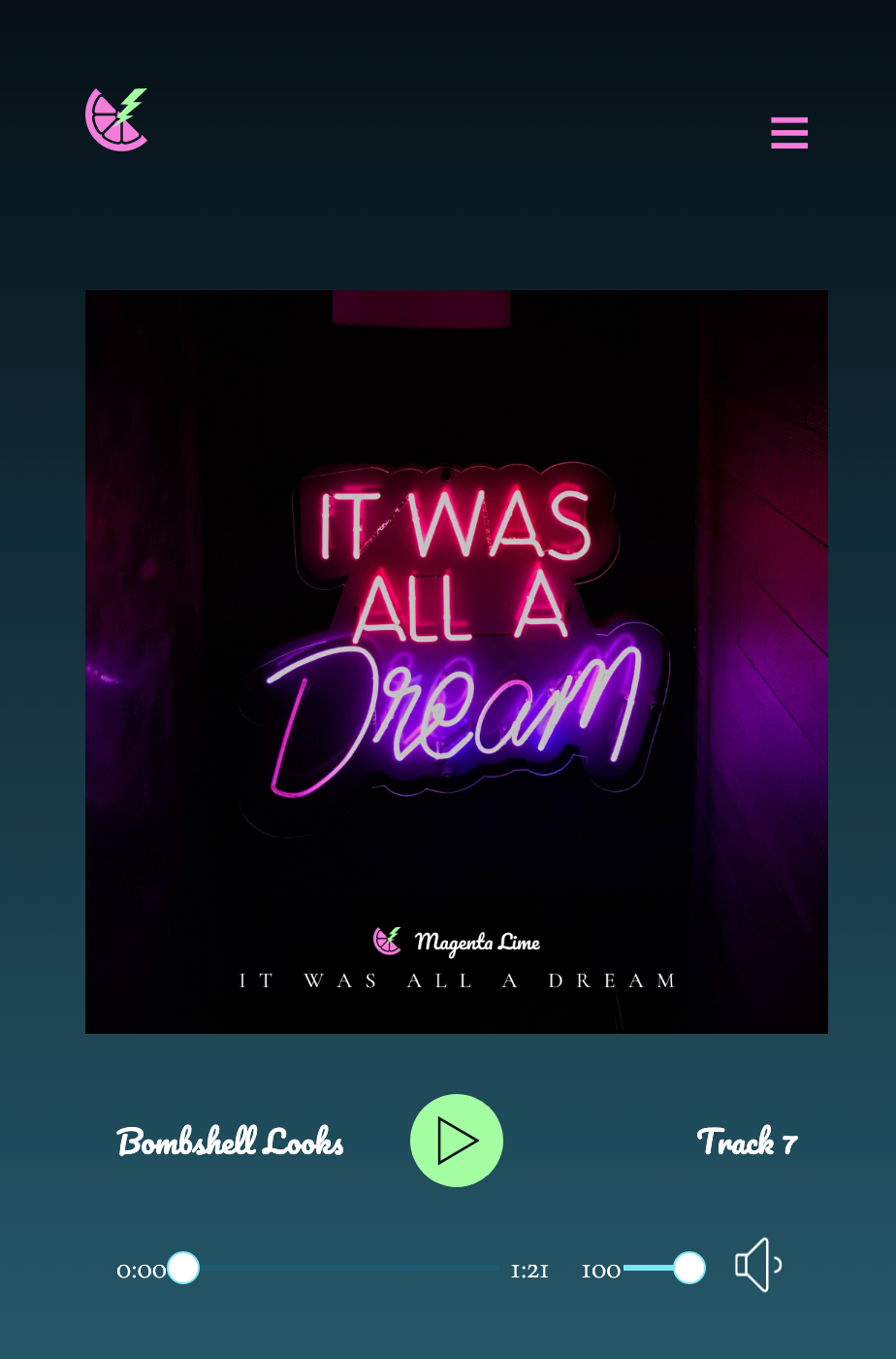
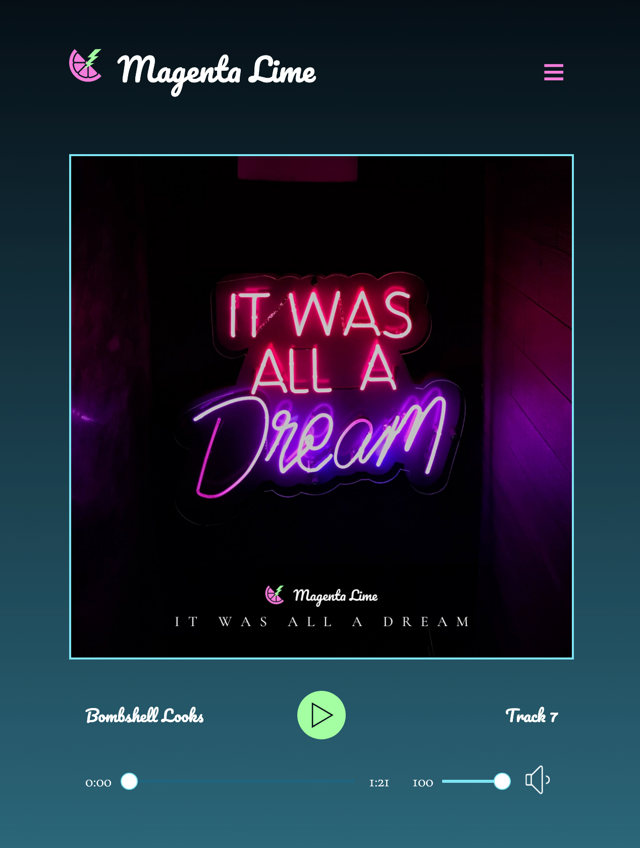
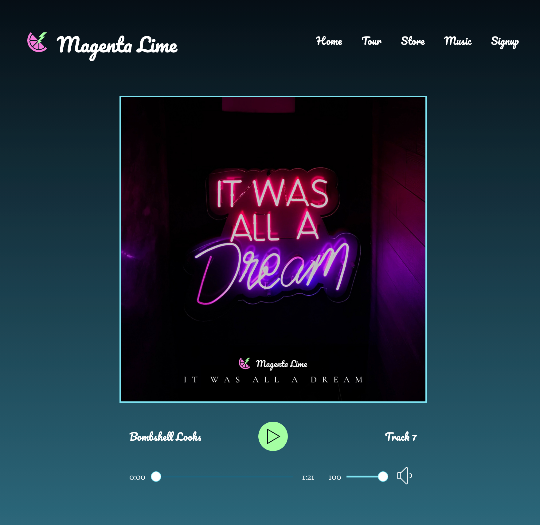
This CodePen includes the navbar, album cover, audio player, and tracklist from our medium design, including markup and CSS.
I've mixed in the CSS from our previous work (base, reviews, album, footer) with the CSS from our medium final design (nav, audio, playlist). Everything seems to be working well.
To the HTML, I've added 2 more links for this design, Music and Signup.
The JavaScript panel contains the scripts to run the hamburger button and the audio player.
Can you make the final tweaks for this design for the navigation? Media queries should be set to 500px, 800px, and 1000px.
5D: Social icons on the cover
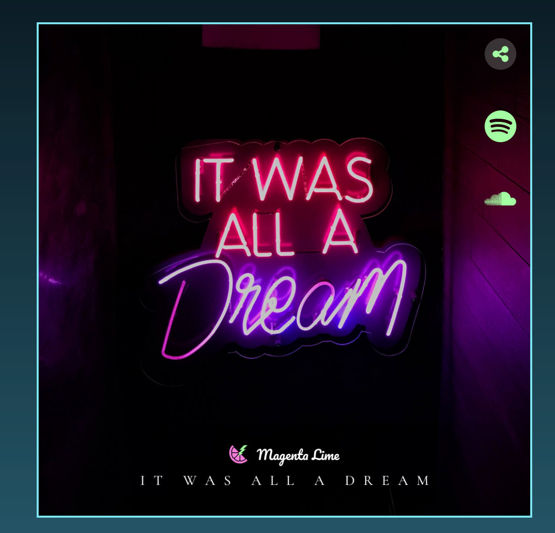
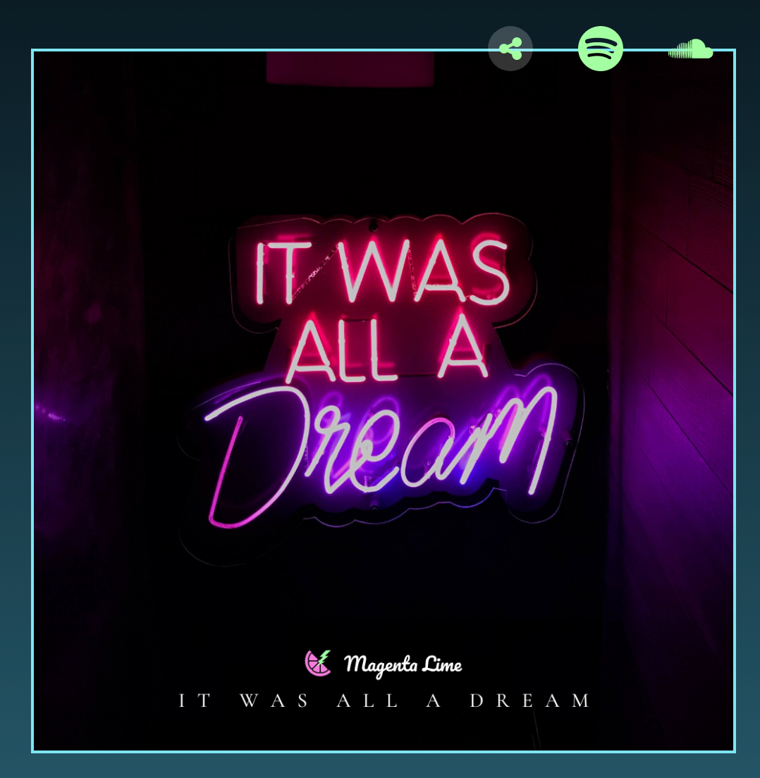
We have social icons that are laid out vertically on mobile and tablet, but horizontally on the edge of the album image on desktop. Should we use Flexbox or Grid? Do we need positioning? If not, what's a great alternative?
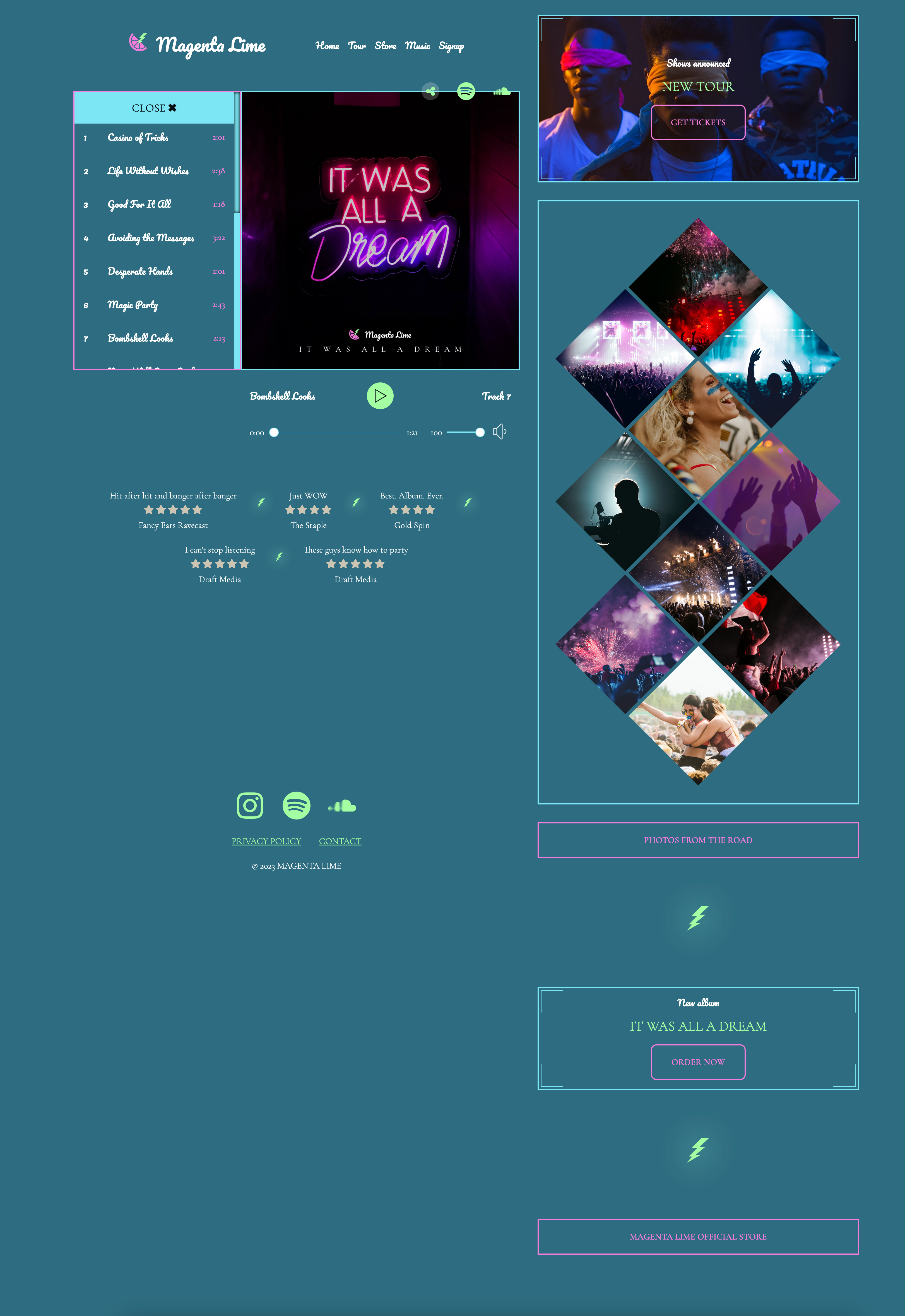
5E: Tracklist on mobile
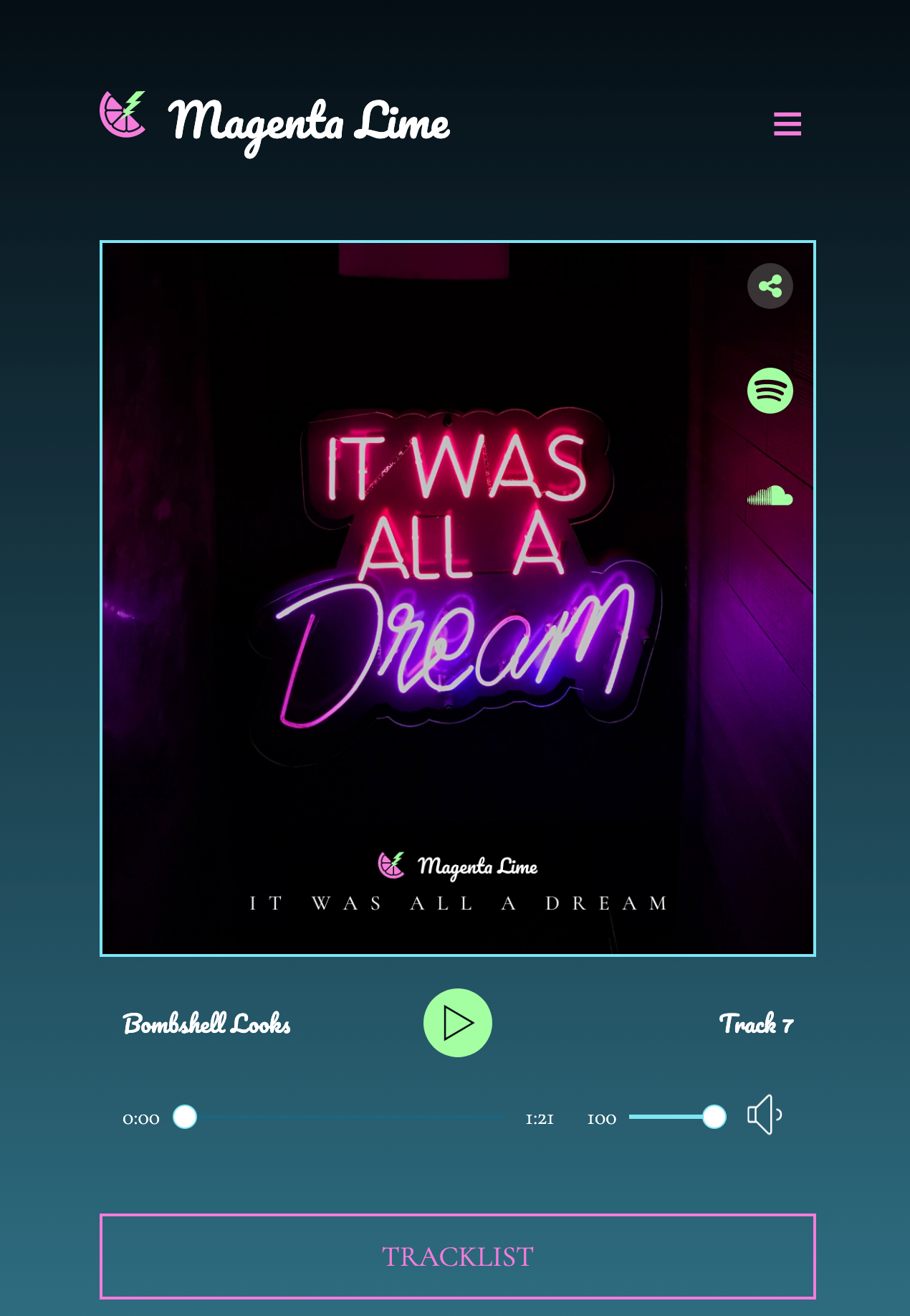
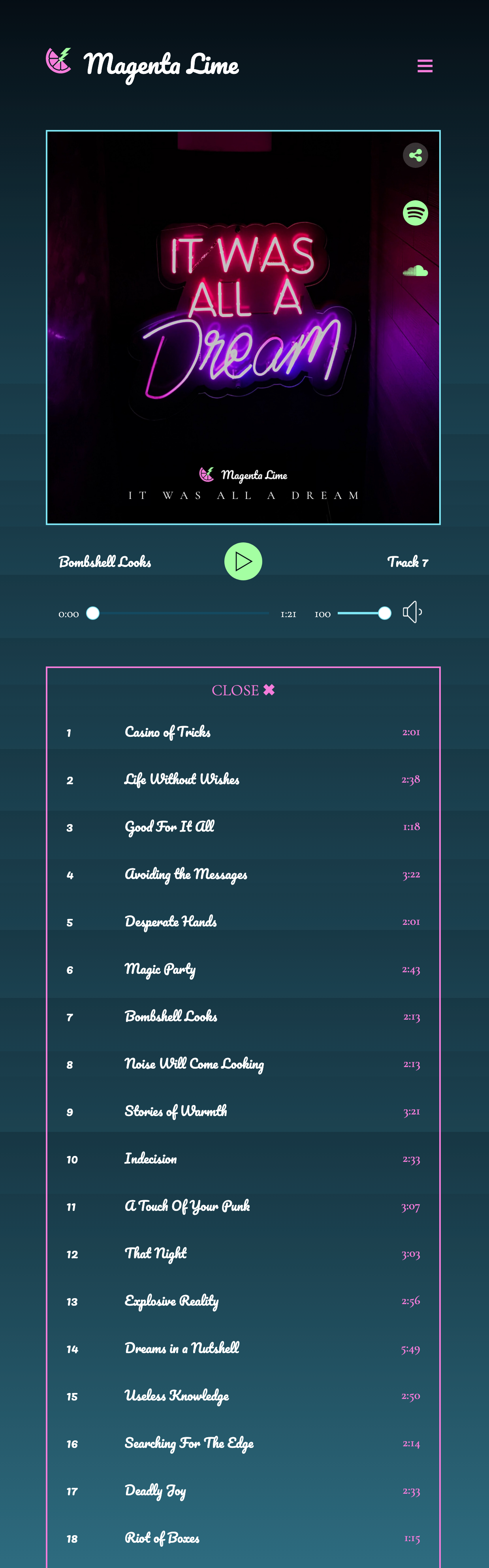
The tracklist for this design is hidden behind a button. When the button is clicked, the tracklist appears.
This is relatively straightforward to code, but when we switch to tablet/desktop, this will get more challenging.
For now, we need to do the following:
- Create the button that, when clicked, will open or close the tracklist, then style it
- Set up the border around the tracklist and additional styling
- Write some JavaScript to make the tracklist appear and disappear.
- BONUS: change text on the button when clicked!
Open and close the tracklist
Some JavaScript you'll need to run the tracklist:
/* hide/reveal the tracklist */
document.querySelector(".button-tracklist").addEventListener("click", () => {
  document.querySelectorAll(".hidden").forEach((item) => {
    item.classList.toggle("showing");
  });
});
In the CSS:
  .hidden {
    display: none;
  }
  .showing {
    display: table;
  }
In the HTML:
<table class="hidden">Changing the button text on click
You'll need this JavaScript to do this.
/* Copied and modified from https://bobbyhadz.com/blog/javascript-change-button-text-on-click

I am very sure you could somehow combine this functionality with the functionality above, but I am not enough of a JS person to do this!
 */

const btn = document.getElementById('tracklist');

// ✅ Toggle button text on click
btn.addEventListener('click', function handleClick() {
  const initialText = 'Tracklist';

  if (btn.textContent.includes(initialText)) {
    btn.textContent = 'Close \u2716';
  } else {
    btn.textContent = initialText;
  }
});
5F: Tracklist on tablet and desktop
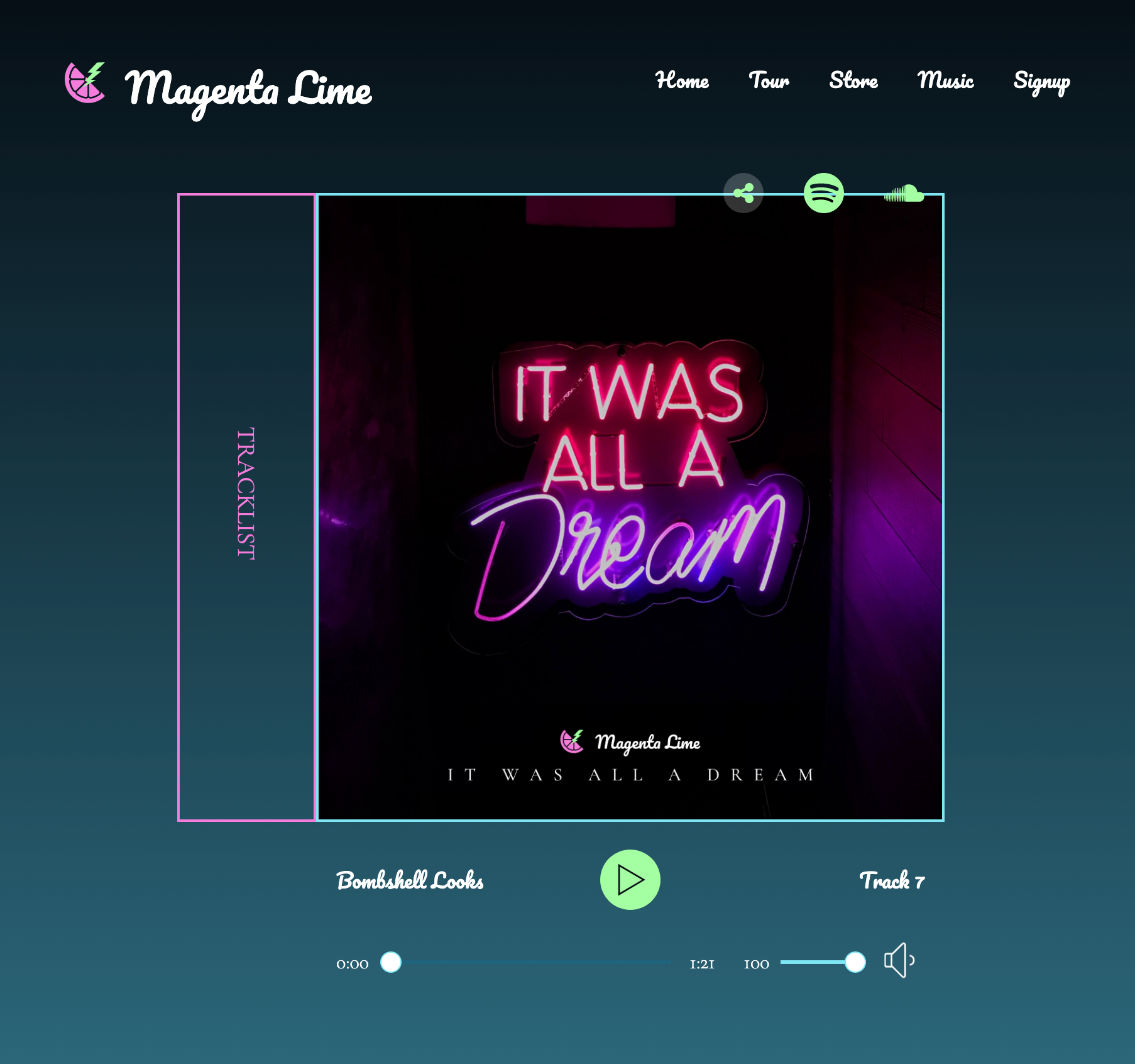
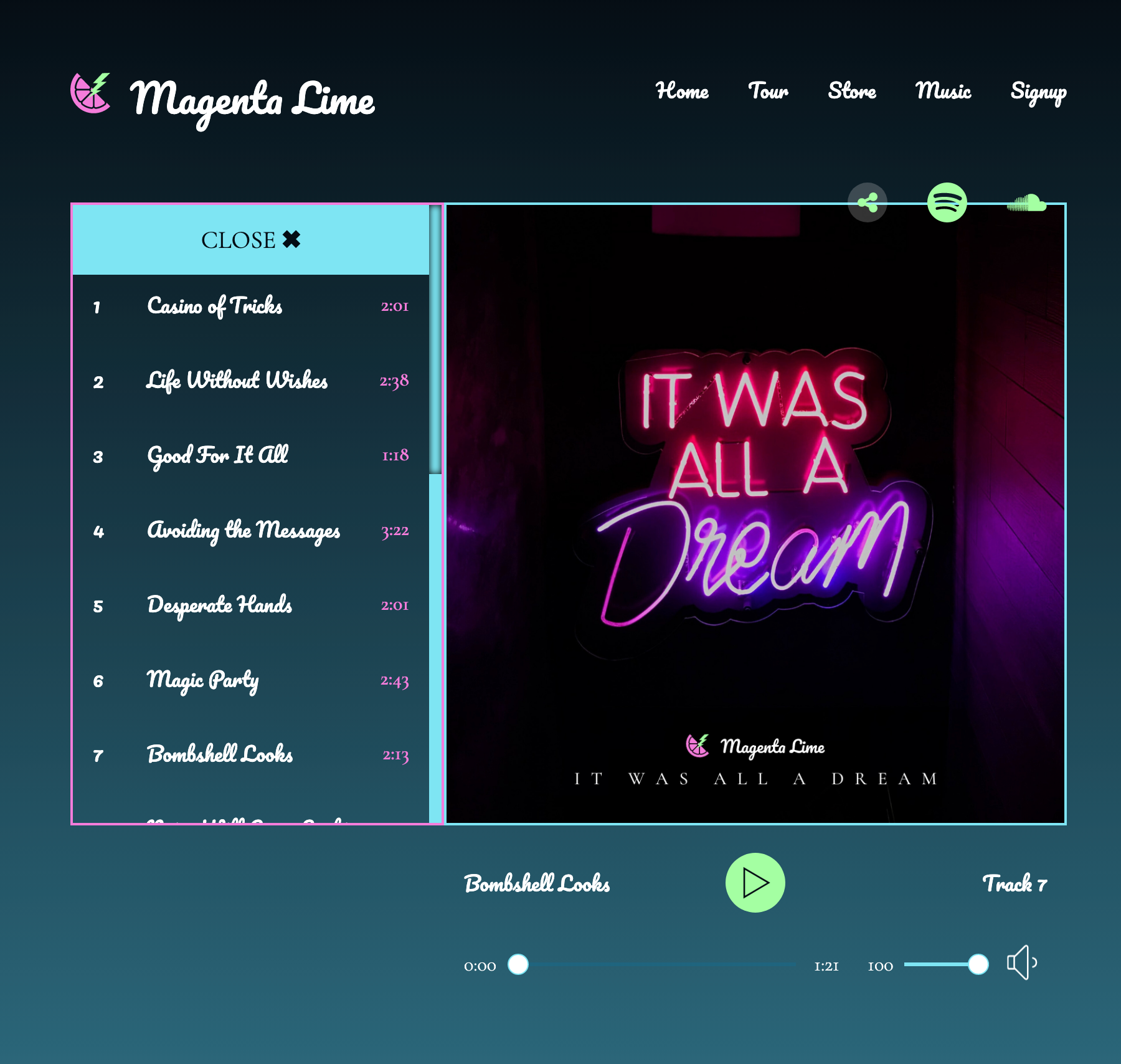
The next thing to do is to get the tracklist up to the left side of the album cover, turn the button on its side, and have the tracklist fly out to the left on click rather than flying down. The design is the same for tablet and mobile.
To accomplish this, we'll do the following:
- Get the tracklist to the left side and make sure it still works
- Format the button
- Fix the formatting so the container grows on click
- Add the fun stuff: animations, scrollbar styling, etc.
5G: Diamonds
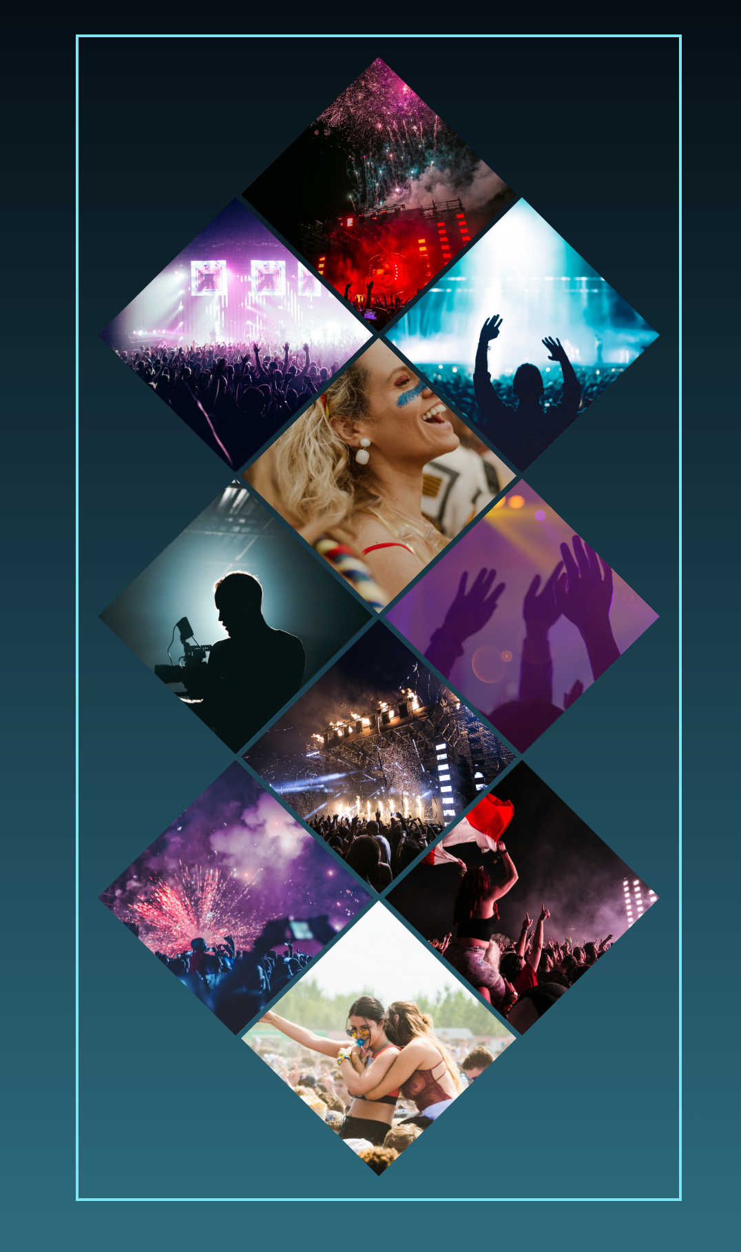
Our starting pen has 10 bullets, and I've given you the styling as background images for each bullet. This is to save time, because it's a lot of typing 😄
5H: Putting it all together
Let's assemble everything we've built into a single page. Your source CodePens include:
Recommended approach
- Fork the "double border corners" pen, which has commenting in the HTML for where additional HTML should be added.
- From the Diamonds pen, copy the CSS and JavaScript and paste to the "double border" pen.
- Copy the appropriate HTML from all other pens and paste into the "double border" pen.
- Test - you should have a design that works for mobile and tablet with a few minor tweaks.
5I: Adding the desktop breakpoint
We'll change our desktop breakpoint from 1000px to 1400px and add a little code to make our desktop design. And that's it -- we're done here!
Want more?
If you want to push this page even further, consider how you could make the tracklist dynamic.
- Create a data source that contains the audio tracks for the album.
- When the name of the track is clicked, that song plays in the audio player.