Chapter 3: Easy Design
Beautiful CSS always starts with great HTML markup... still! In this chapter, we'll mark up the content with HTML as best we can, based on the mobile design. Next, we'll apply existing CSS from the style guide. We'll add CSS to make this look like our screenshots. And finally, of course, we'll make it all responsive.

3A: Marking up the HTML
Our HTML order will include the header, opening image, tour list, images and reviews, and the footer.
Useful CodePen image links:
https://assets.codepen.io/296057/fem-maglime-logo.svg

https://assets.codepen.io/296057/fem-purple-arms.jpg

https://assets.codepen.io/296057/fem-fireworks.jpg

https://assets.codepen.io/296057/fem-blue-arms.jpg

https://assets.codepen.io/296057/fem-blindfold-475.jpg
3B: Header, banner, tour styling
Because our CSS gets long, I'm going to use @layer to group our CSS in our document. @layer is supposed to be used for controlling the cascade (see my Intermediate HTML and CSS course). However, here we'll use it to easily collapse a bunch of styles in our CSS so we can navigate our stylesheet more easily. You do NOT need to use @layer this way in your production code!!! This is a teaching trick only.
When finished with this step, your page should look something like this (click for larger format):

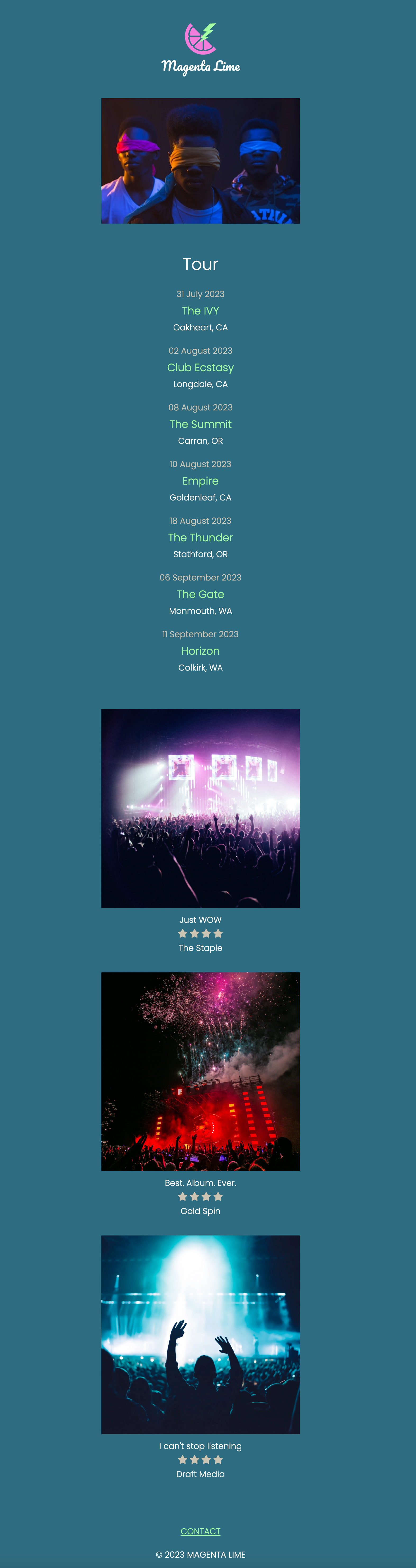
3C: Reviews and images
To get the review under control, we need to do the following:
- Set images to have spacing on top
- Set stars to a smaller size and next to each other
- Style the quotes to look like the design
- Establish spacing between tour and reviews
When finished with this step, your page should look something like this (click for larger format):
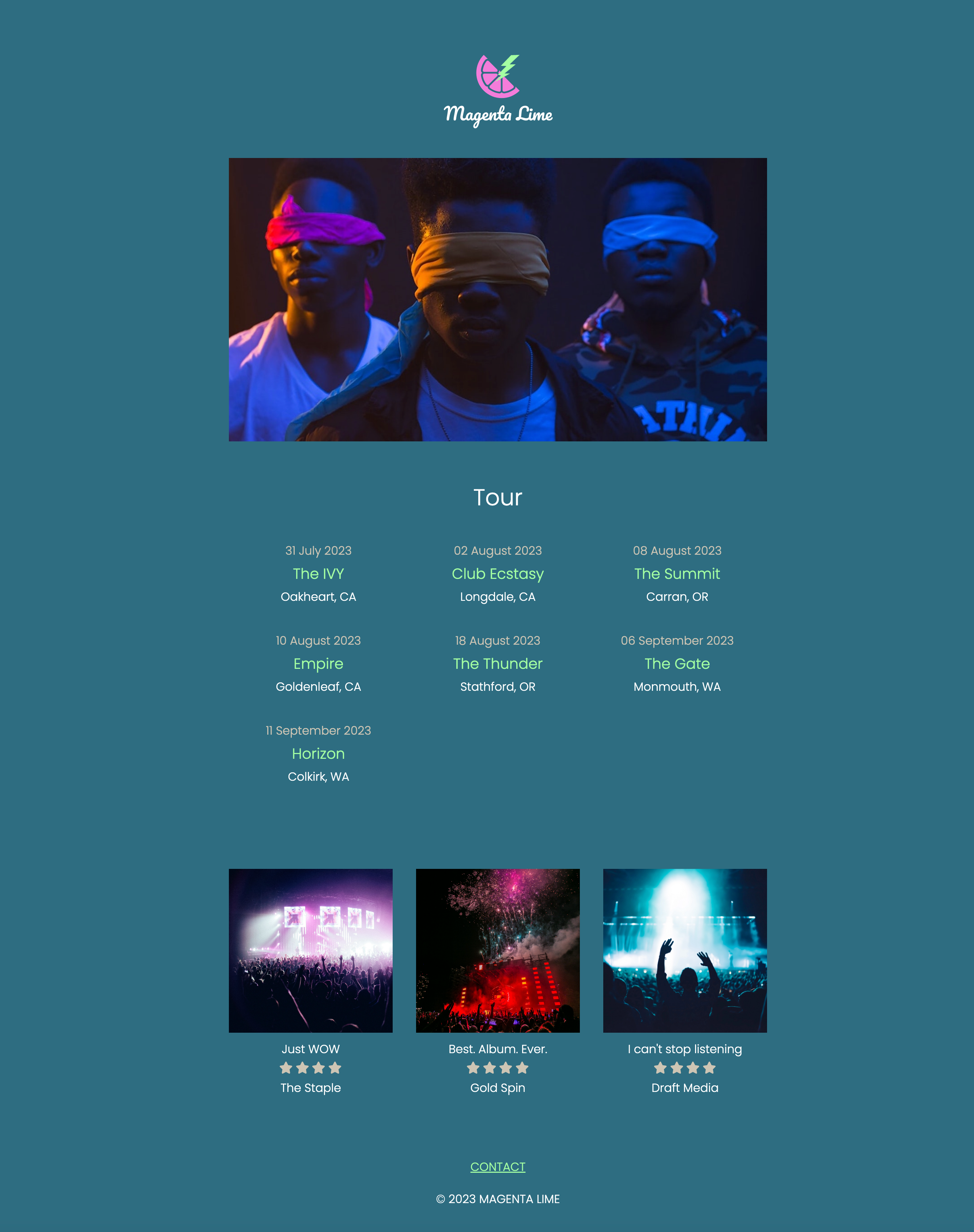
3D: Tablet Design
Approach: Override styling for a tablet design in a media query, leveraging existing styles and making changes where needed.
Tips:
- First, work on each section of the page and its own layout.
- What changes between layouts? Say it out loud or write it down to clarify your thoughts. "The tour dates section starts on mobile with one column with everything stacked and centered. It moves to tablet with three columns with spacing between each item. Then it moves to desktop with one column on the right side of the page."
- Some layouts happen within each section, while other layouts happen within the page itself. Focus on the section layouts first, then on the page layouts. Get the rough locations first before worrying about perfect spacing and alignment.
- Never hesitate to throw in borders or background colors to aid styling. If you can't see it, you can't style it!
We will style the wrapper, banner image, tour section, reviews and images, and finally the header and footer.
When finished with this step, your page should look something like this (click for larger format):

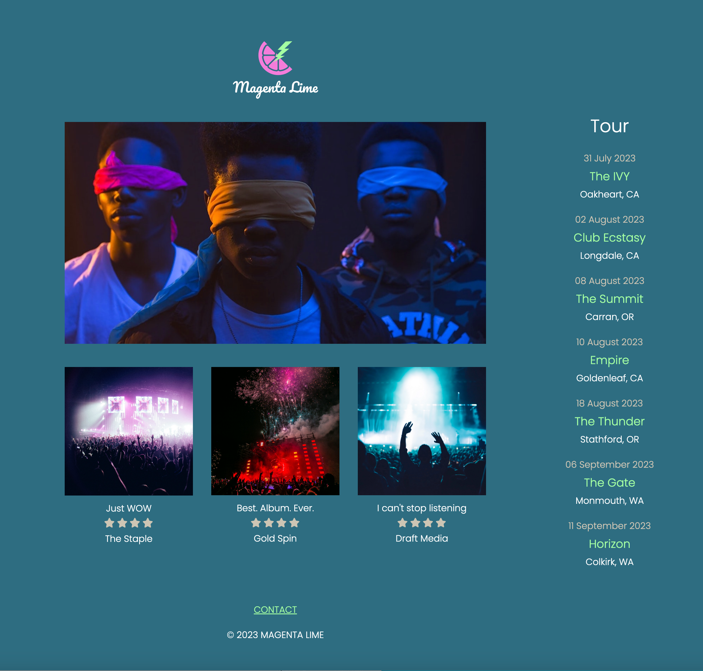
3E: Desktop layout
Override styling for a desktop design in a media query, leveraging existing styles and making changes where needed. We'll start with the wrapper and move on to the tour dates.
Tips
- First, work on each section of the page and its own layout.
- What changes between layouts? Say it out loud or write it down to clarify your thoughts. "The tour dates section starts on mobile with one column with everything stacked and centered. It moves to tablet with three columns with spacing between each item. Then it moves to desktop with one column on the right side of the page."
- The entire footer is about 400px wide at all dimensions. (You don't need any responsive design.)
- Some layouts happen within each section, while other layouts happen within the page itself. Focus on the section layouts first, then on the page layouts. Get the rough locations first before worrying about perfect spacing and alignment.
- Never hesitate to throw in borders or background colors to aid styling. If you can't see it, you can't style it!
When finished with this step, your page should look something like this (click for larger format):
