Chapter 1: Prerequisites and getting set up
Part 1: About the websites
In this course, we'll build three websites for Magenta Lime, a fictional band.
Easy Site
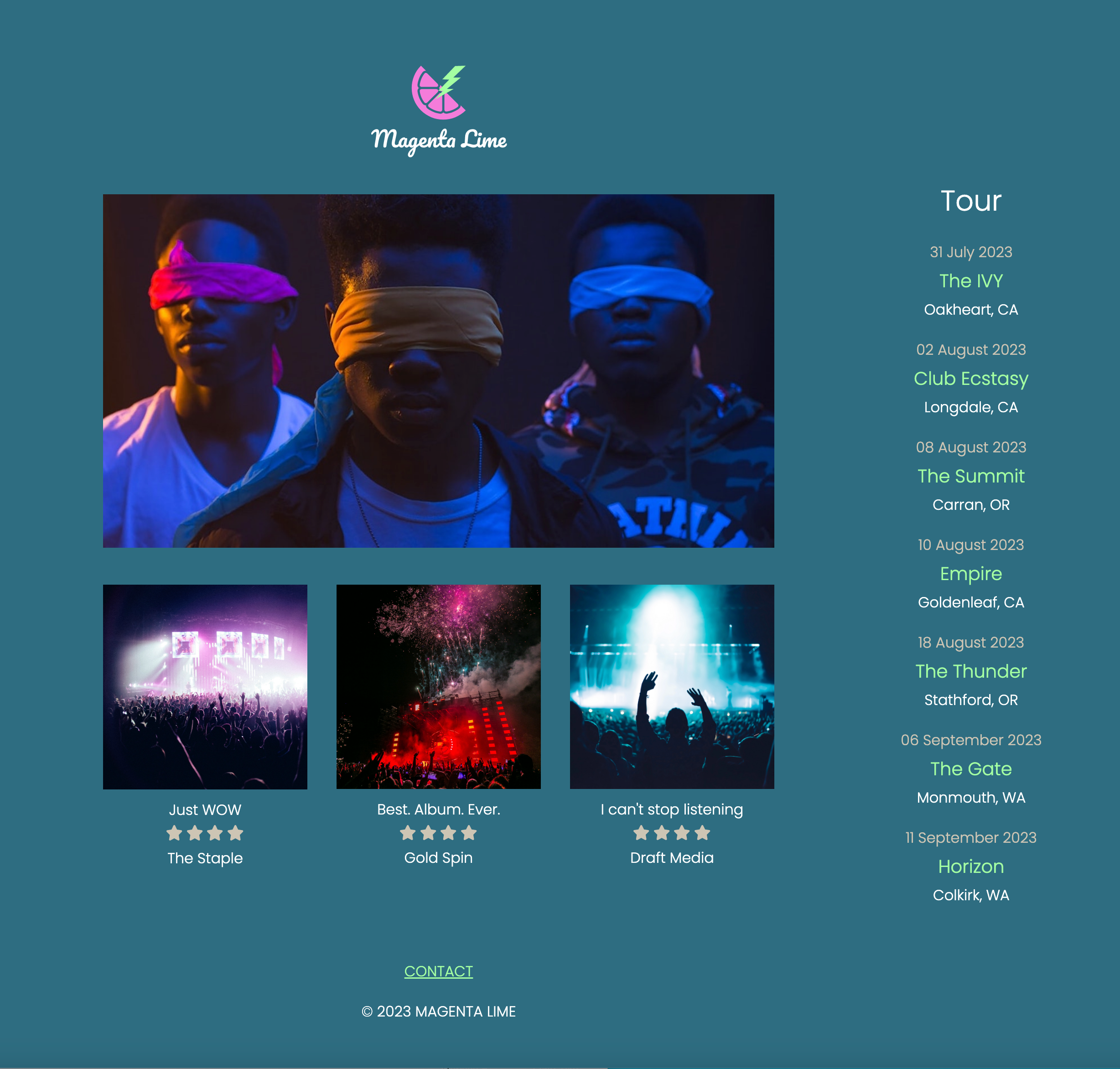

The easy website features a straightforward layout with a few twists. We'll discuss good markup, setting up base styling with colors, fonts, and element selectors, and we'll talk about whether Flexbox or Grid is a better approach to layout.
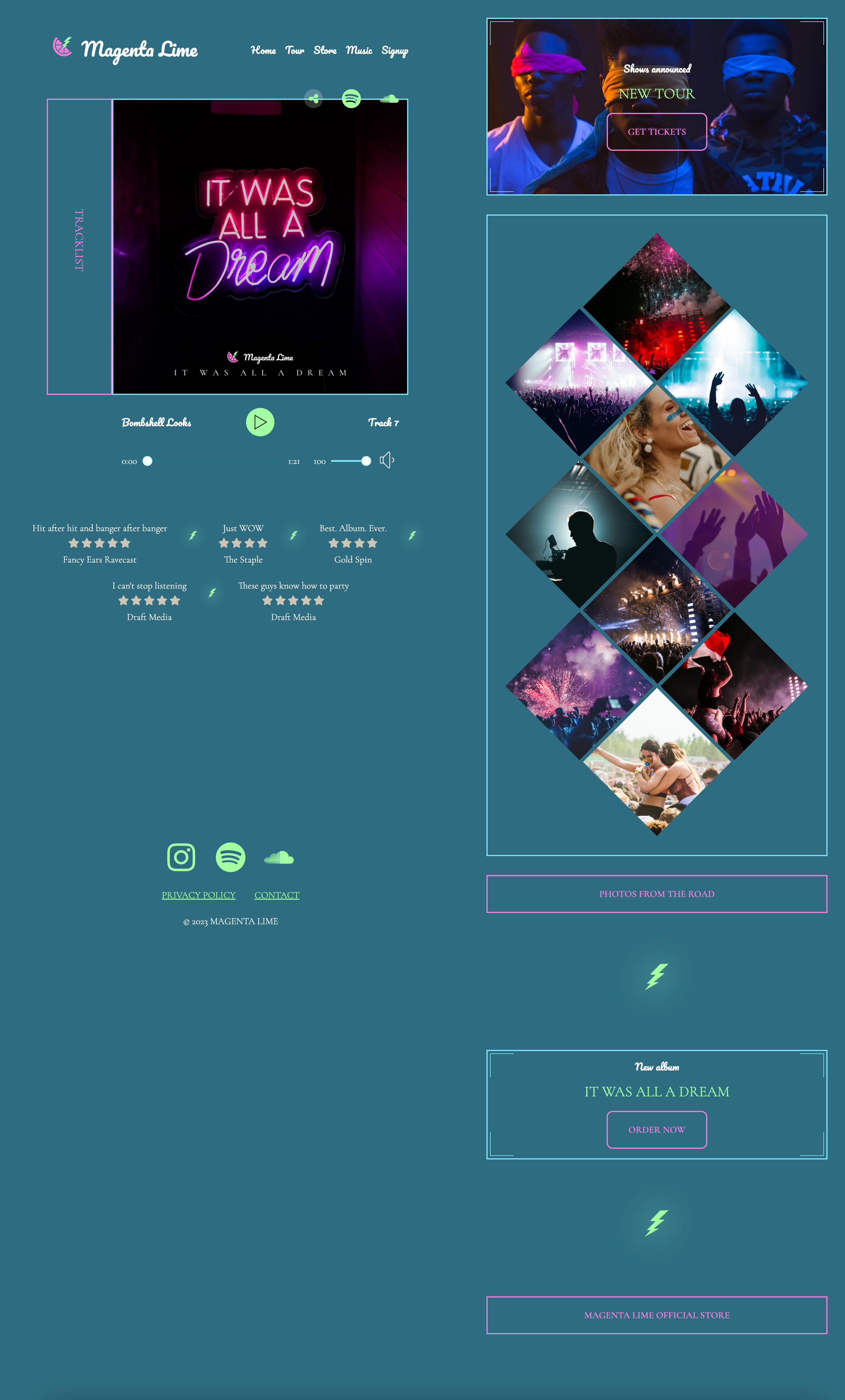
Medium Site
NOTE: The background gradient is missing in these screenshots.
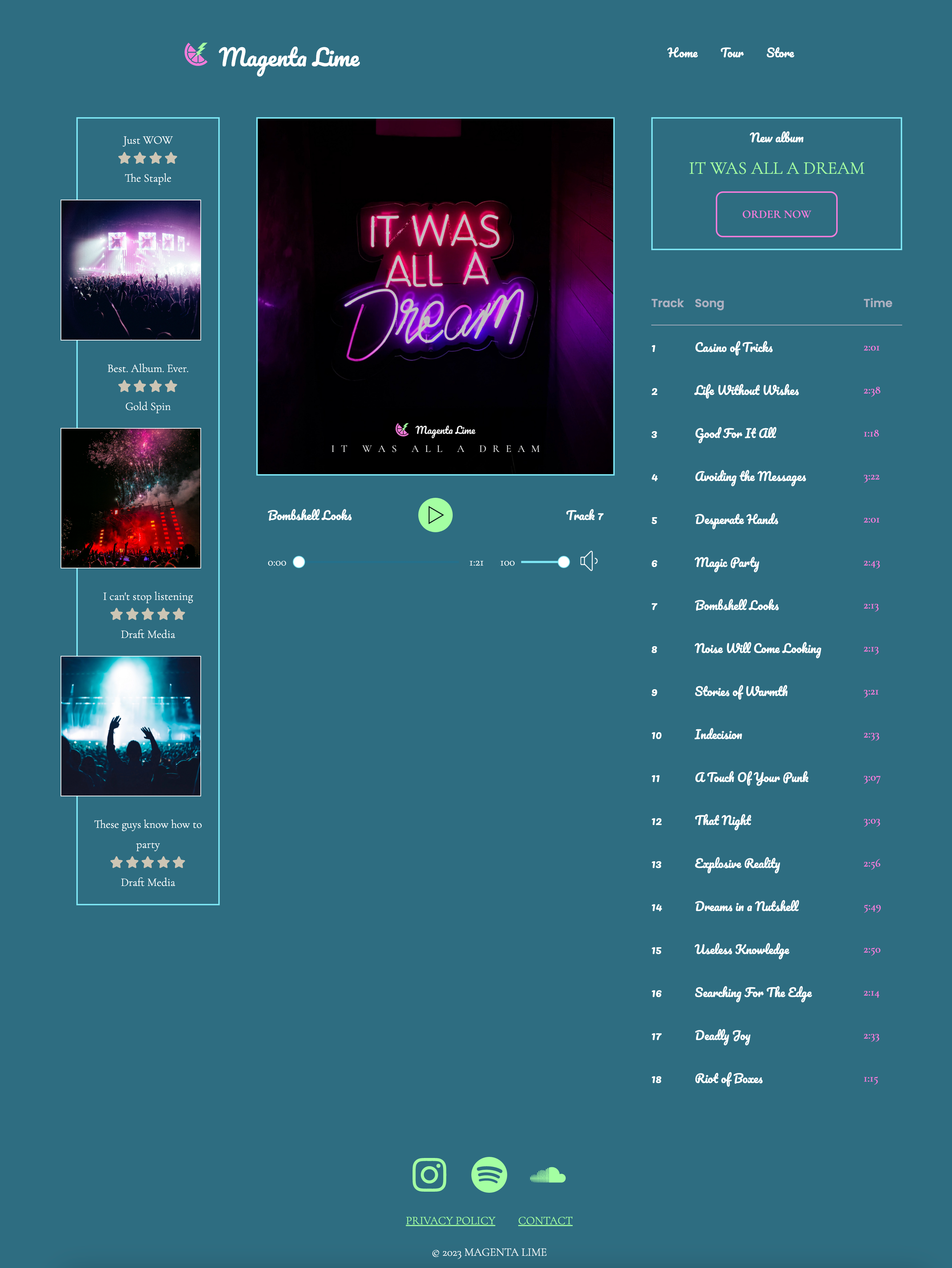
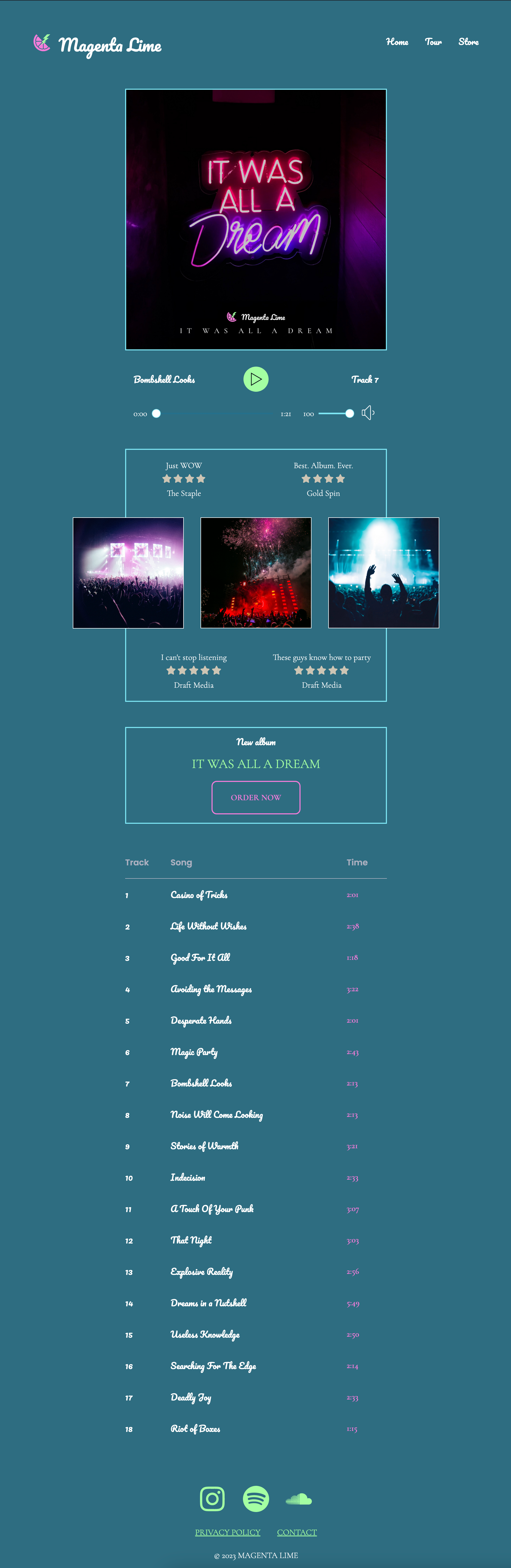
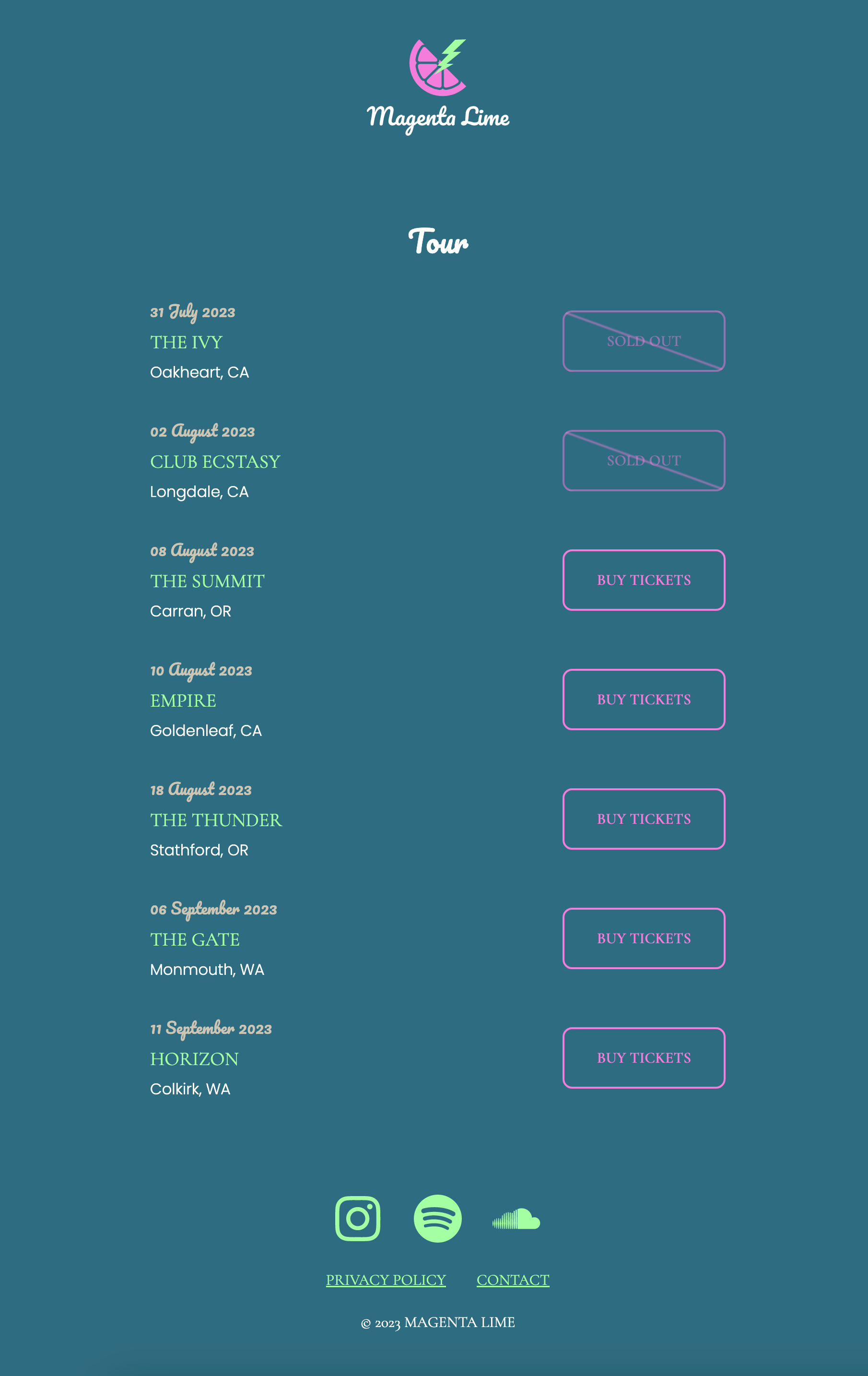
The medium website takes our designs up a notch. We'll use the same base styling from our easy design, but we'll add more elements in more interesting ways.
Follow the differences between sections of this page. How do we deal with the reviews and small images and their radical layout changes? What about styling an audio player -- that works via JavaScript? How should we mark up the tracklist? How did we get that diagonal line across those "sold out" buttons?
Difficult Site
NOTE: The background gradient is missing in these screenshots.
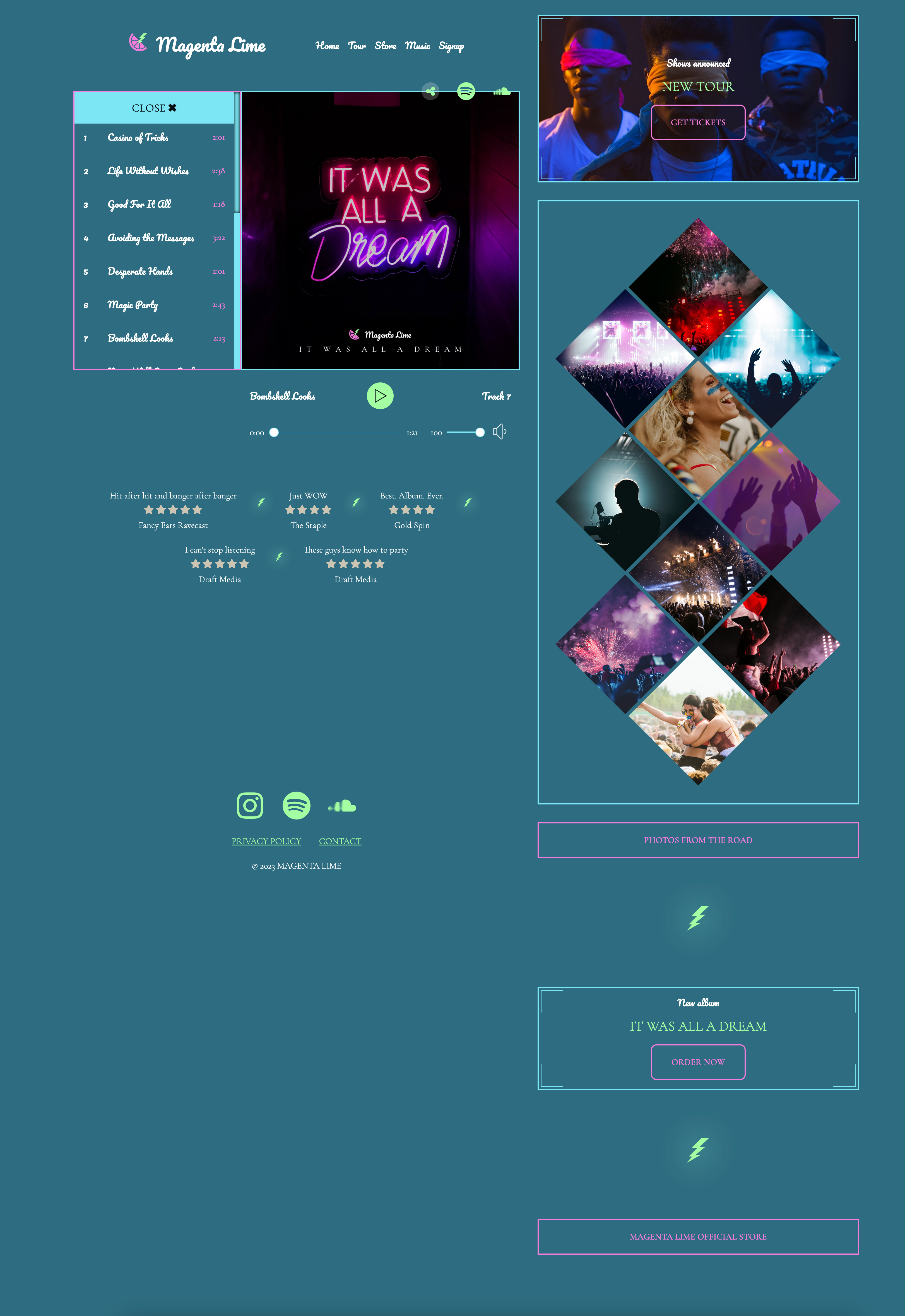
The difficult website pushes our skills even further with a few new elements. Check out the working tracklist, where pressing a button will open or close the list. And are those diamonds? Yes, 10 individual images, displayed as a series of diamonds. They start as square images. Also note the double border corners on some boxes, and those icons to share the album change from vertical to horizontal in their orientation as well.
Part 2: What you should know before taking this course
- It's assumed you have a solid working knowledge of HTML and CSS. You don't need to be an expert, but you should understand the basics.
- STRONGLY RECOMMENDED - Grid & Flexbox for Responsive Layouts, v2 or similar knowledge of Flexbox and Grid.
- Understanding of CSS, selectors, variables, calc(), and general styling recommended.
Part 3: Technology requirements
Jen will be working in CodePen, a free online editing environment for HTML, CSS, and JavaScript. It's easy to see code and how the page looks at the same time, which makes this setup ideal for teaching.
This course offers a CodePen collection with all beginning and ending states for every exercise.
Not a CodePen fan? Feel free to copy/paste to JSFiddle, VSCode, or any other editor you prefer.
The Github repo for this course contains images, links to resources, and Jen's teaching notes. It does not contain any materials used actively in the course, as all of these are contained in the CodePens.
This course does not cover professional workflows. If you want to add your own workflows, you are welcome to do so. The course offers basic HTML, CSS, and JavaScript so you can manage it however you want. Have fun!